Earthli is now 100% responsive
Go ahead. Open earthli.com on a small-screen device. Get out your phone. I’ll wait.
Pretty cool, right?
I mean, it’s not rocket science, but it involves no small amount of work to come up with a design that works at both very wide and very narrow screens. Sure, I could have used Bootstrap, but then my site would look exactly like everyone else’s. Also, earthli’s stylesheets and components are much simpler and easy to use than Bootstrap.
Not only that, but with the redesign and the continued focus on simplicity in page design, semantic structure, etc., it turns out that earthli also does quite well for accessibility.
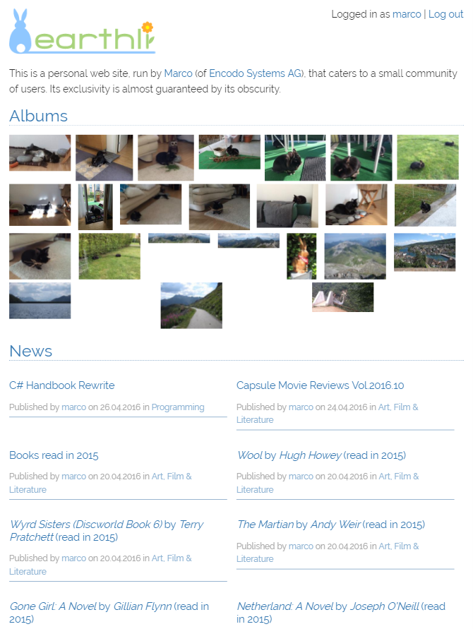
Home page
The home page demonstrates the new responsive grids and columns.
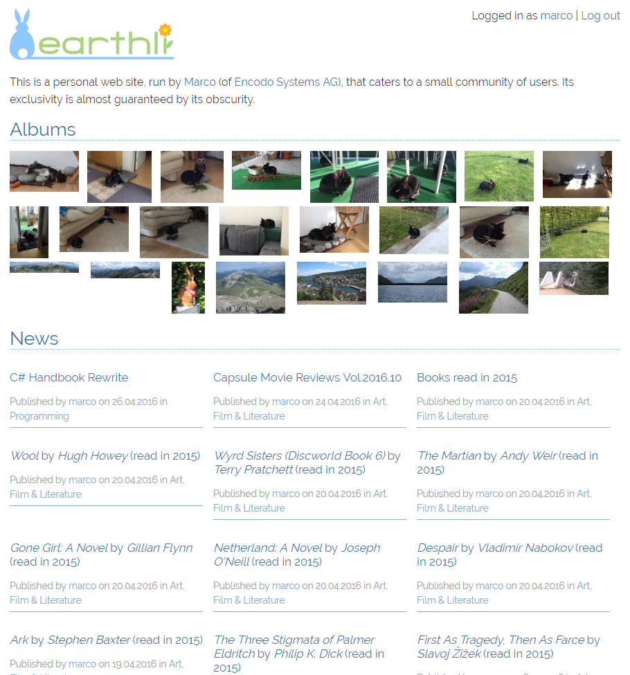 Home page at standard width
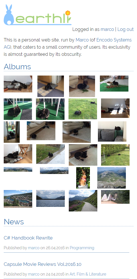 Home page − small-screen
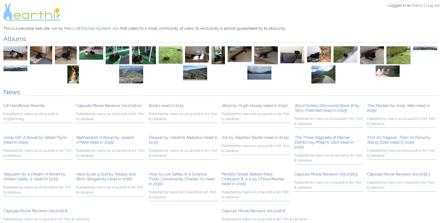 Home page − wide-screen
For this page, I’ve included samples taken from the Opera device emulator to show that the responsiveness actually works for mobile devices now—no more scaling and zooming on your phone.
 Home page on the iPad
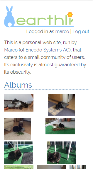 Home page on the iPhone 5
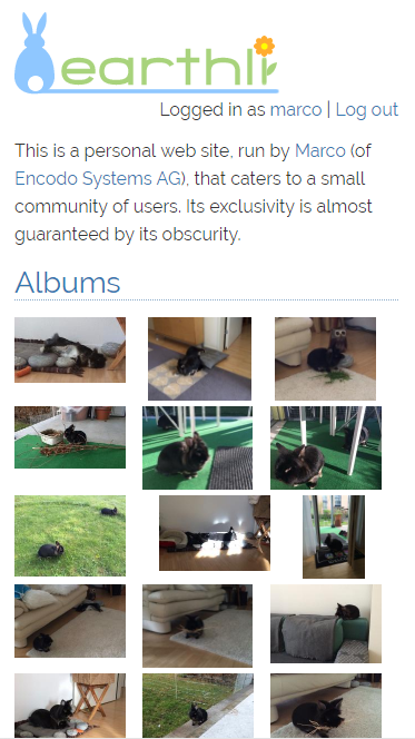 Home page on the iPhone 6
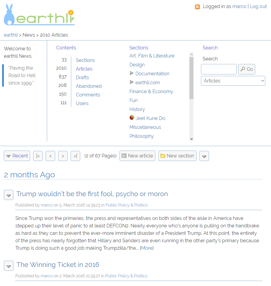
News Index
The News home page demonstrates how I converted the top-level navigation area to use responsive columns and how the articles are now shown truncated to a limited length and in grids, instead of full-length and in a single 900-pixel–wide column. At a standard resolution, the tile still stretches across the whole page, but beyond that size, it switches to multiple columns, to improve readability and use space more efficiently.
 News index − standard size
 News index − small-screen
 News index − wide-screen
Webcore Index
The WebCore index is a custom section of earthli, with a column to each side, and a responsive grid in the middle section. With just a handful of simple directives, the browser makes the best use of the available space.
 Webcore index − standard size
 Webcore index − small-screen
 Webcore index − wide-screen
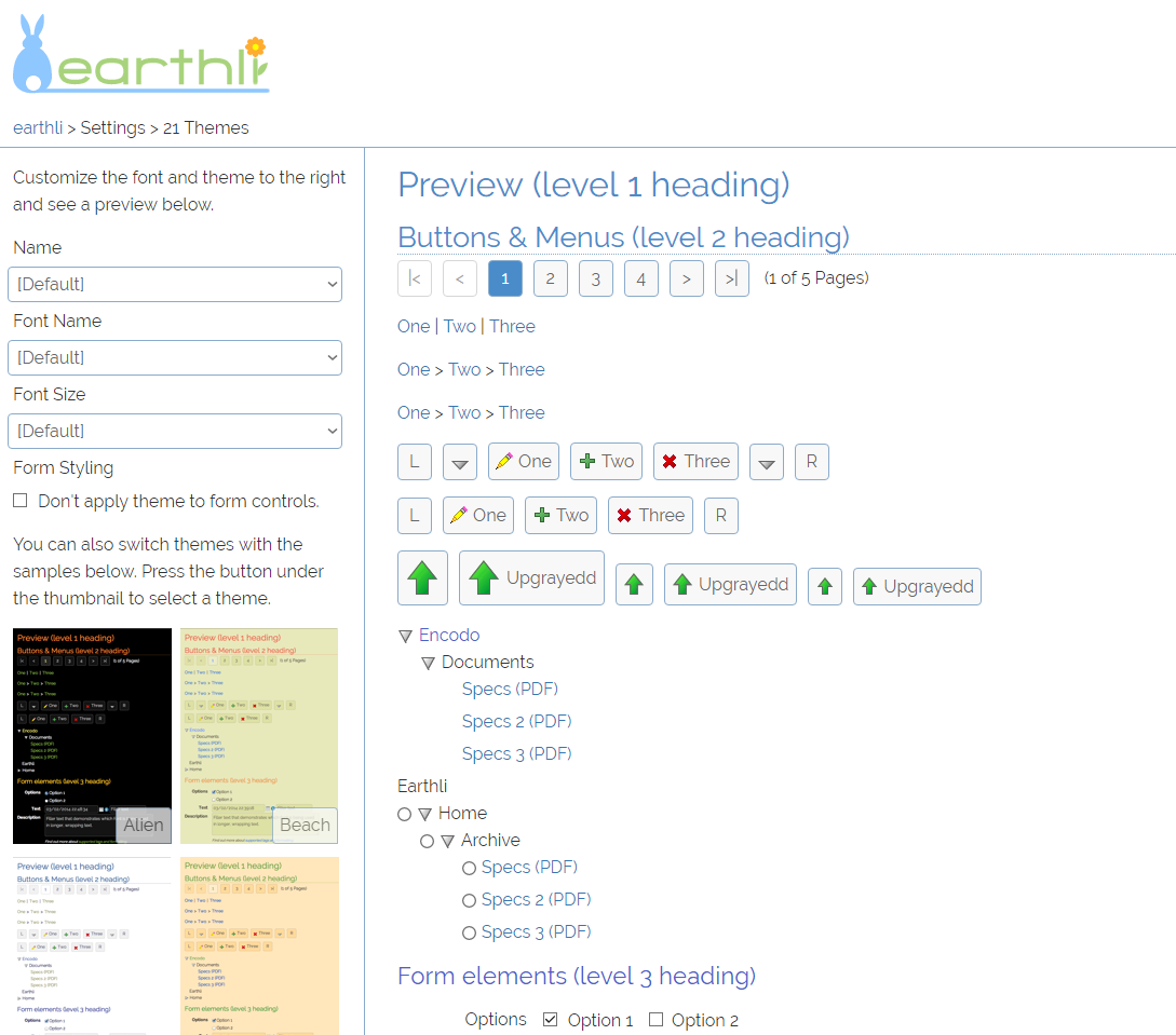
Theme Settings
The theme settings page also combines a lot of different elements: a responsive grid of content-sized tiles for the theme thumbnails, a form with top-aligned labels and responsive width, another form—the test form below the fold, not shown in the screenshots—which shows how the left-hand labels are moved to the top at smaller screen widths.
This page also uses a smaller column on the left with a content area on the right. These columns share the space in a given ratio at wider resolutions, but are stacked at smaller screen widths.
 Theme settings − standard size
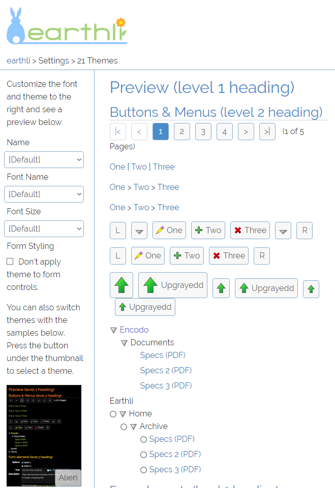 Theme settings − small-screen
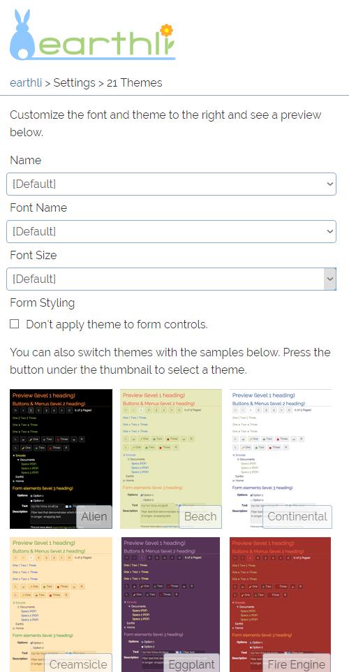 Theme settings − single column
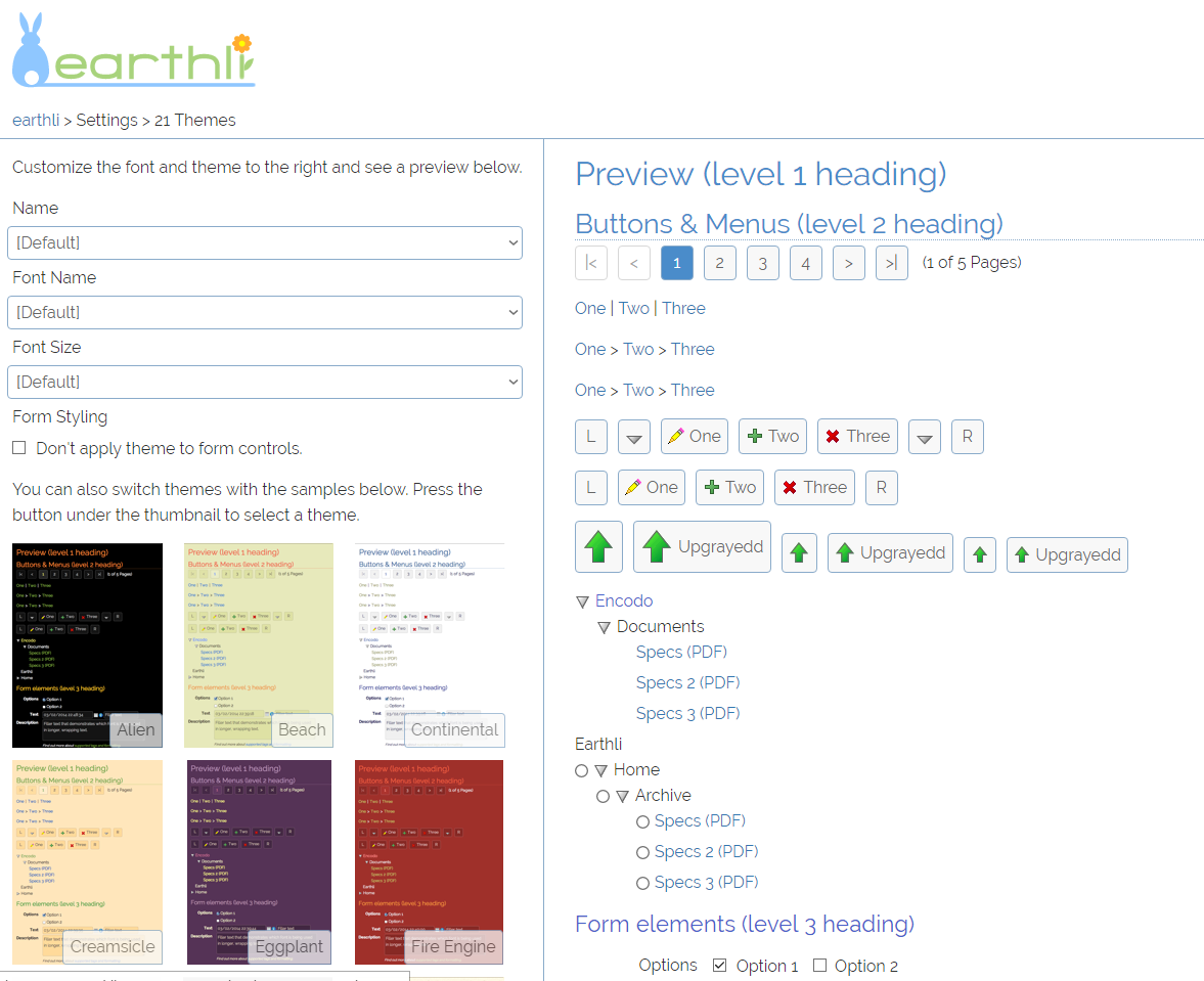 Theme settings − wide-screen
Read Article
When you read an article, it now makes much better use of the space. In a standard size, the page looks about the same it did without responsive design (where the page width was fixed at 900 pixels). However, at smaller widths, the page collapses as expected.
The neat trick on this page is that at larger widths, the layout starts splitting content into columns so that you never have to read really long lines. The drawback to this approach is that, for longer articles, you have to manually scroll back up to the top of the next column. However, I think that’s more acceptable than displaying text in 2000-pixel–wide paragraphs.
 Article page − standard size
 Article page − small-screen
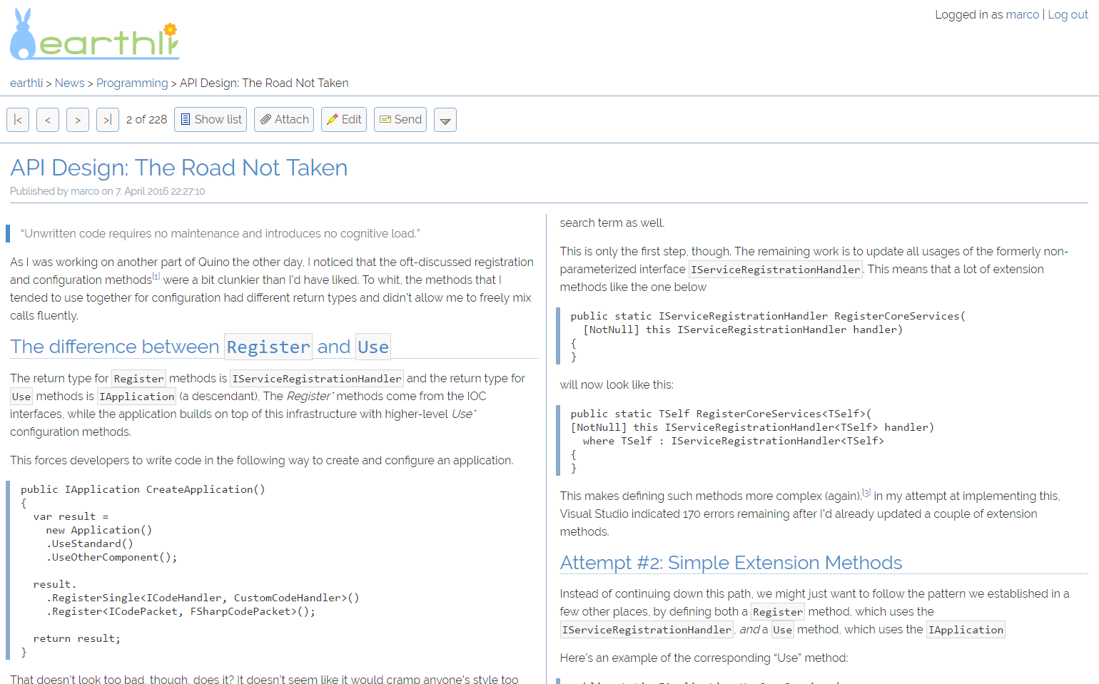 Article page − two columns
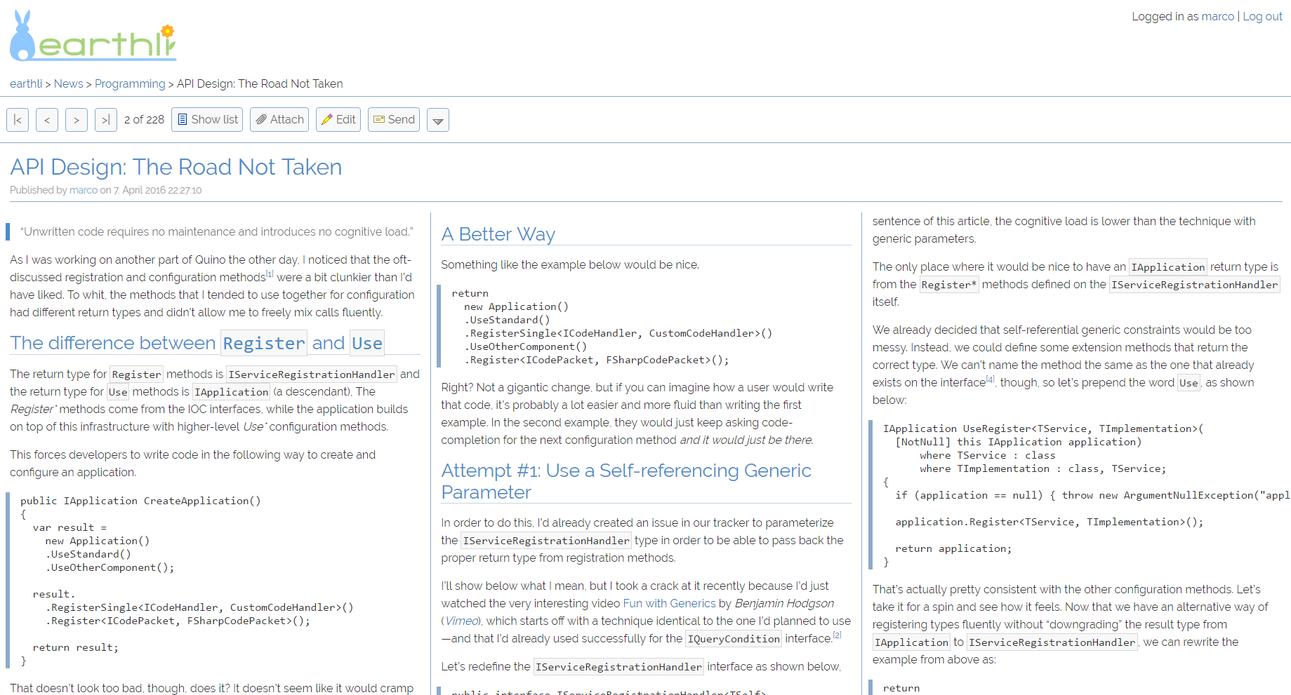 Article page − wide-screen
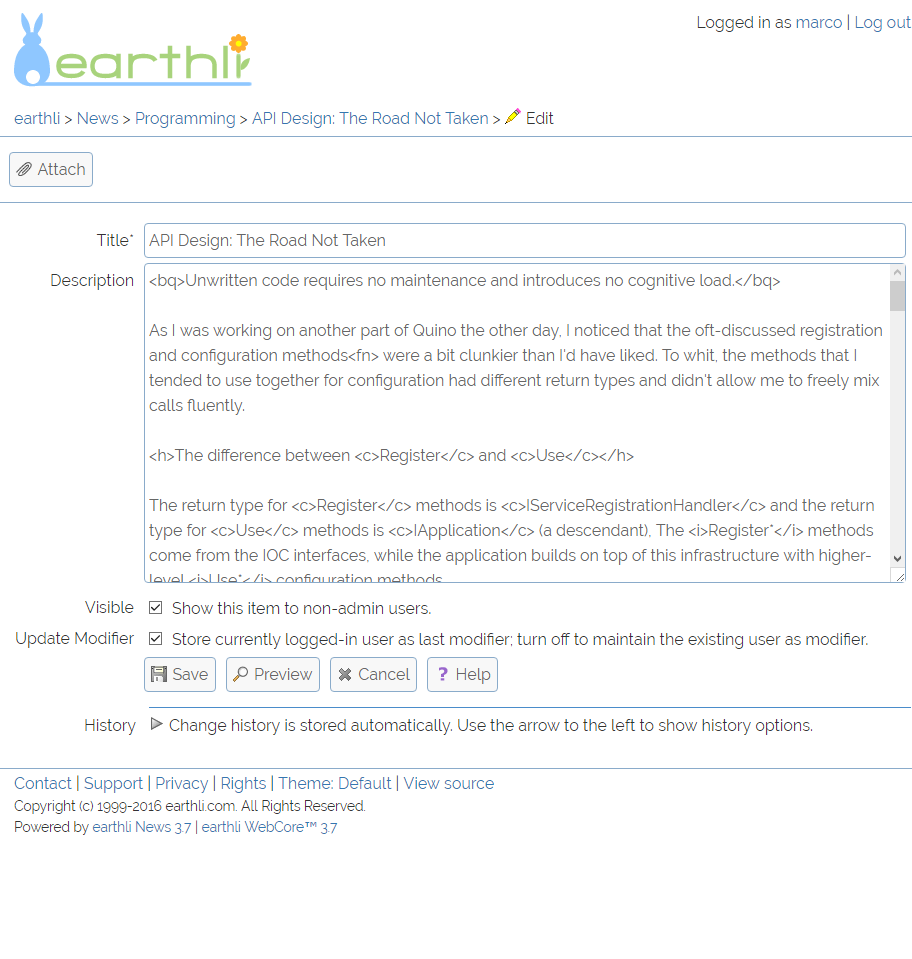
Edit Article Form
As mentioned above, the forms are also responsive: at smaller viewport widths, the labels move from left-aligned to top-aligned automatically. Any form can now be used on a small mobile device, limited only by the limitations of the device rather than any forced layout in the form itself.
In this way, the form makes the best use of horizontal space, keeping the form as vertically short as possible if there is screen space. If there is not, the form uses more vertical space, but avoids horizontal scrolling. I think this is a good trade-off.
Additionally, If you work on larger texts, there is a new full-screen editing mode, that maximizes the preview area and editing areas to share the screen equally.
 Edit Article − standard size
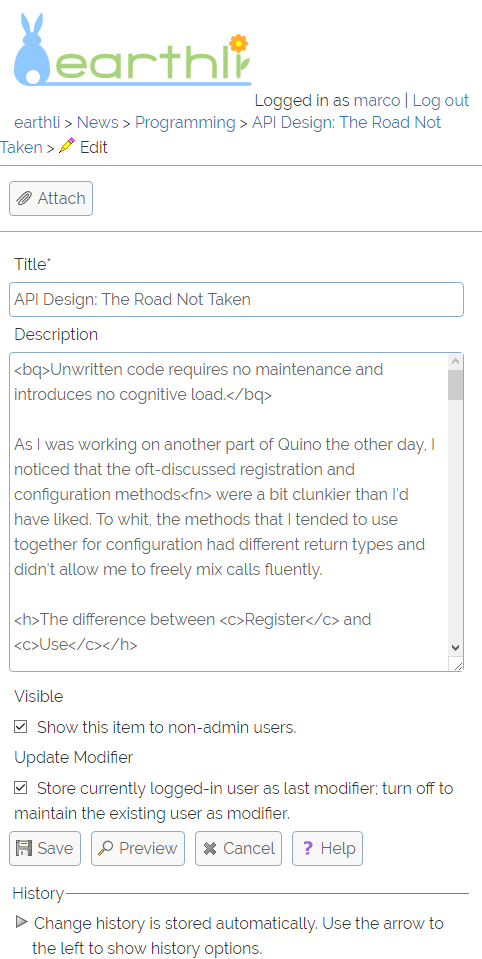 Edit Article − small-screen
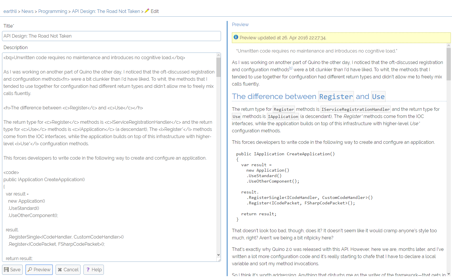 Edit Article − full-screen
Albums Index
And, finally, I’ve included a screenshot of the Albums home page, to show off how it also makes maximal use of the screen width, creating new columns as space allows rather than being hard-coded to three columns, as it used to be.
Conclusion
I’m pretty happy to have gotten to this point with earthli, which turns … 17 years old this year. Even after all that time, I’ve managed to keep it looking relatively modern and based on modern technologies.
- Everything is now HTTPS.
- LESS-based single stylesheet with a consistent UX and VSG for the entire site
- Simple, responsive design for all pages
- Very good scores on mobile-friendliness from Google
- Very good scores on accessibility from other sources