WebCore 3.5: new form styles
Published by marco on
This is an old post that I never finished when I released earthli WebCore 3.5 almost a year ago. The design analysis is still pretty relevant, as are the conclusions about flexbox.
We released version 3.4 of the earthli WebCore over a year ago, in June 2013. That release introduced a new overall style that was both looked more modern and also conformed to recent design/development standards. See that article for more information about what would turn out to have been stage one of two stages of a style update.
If you look at the release notes for 3.5, you’ll note that almost all of the changes occurred in the rendering part of the framework. In fairness, the issues don’t even begin to cover it. What the release actually contains is the following:
- Removed all inline CSS styles from everywhere in the web site. Replaced everything with CSS classes, where needed.
- Removed all explicit 100% widths from containers. CSS determines whether a container has its natural width or the default 100% width or another, smaller width
- Grids, forms, calendars and column layouts no longer use tables for layout. The default CSS still uses
table,table-rowandtable-celldisplay types but that is temporary. The only tables left are containers that really should be represented as tables.
The visual style is more consistent throughout, as you can see in the examples below. Click the images to see specific notes.
Home & Index Pages
 Minor changes to the home page
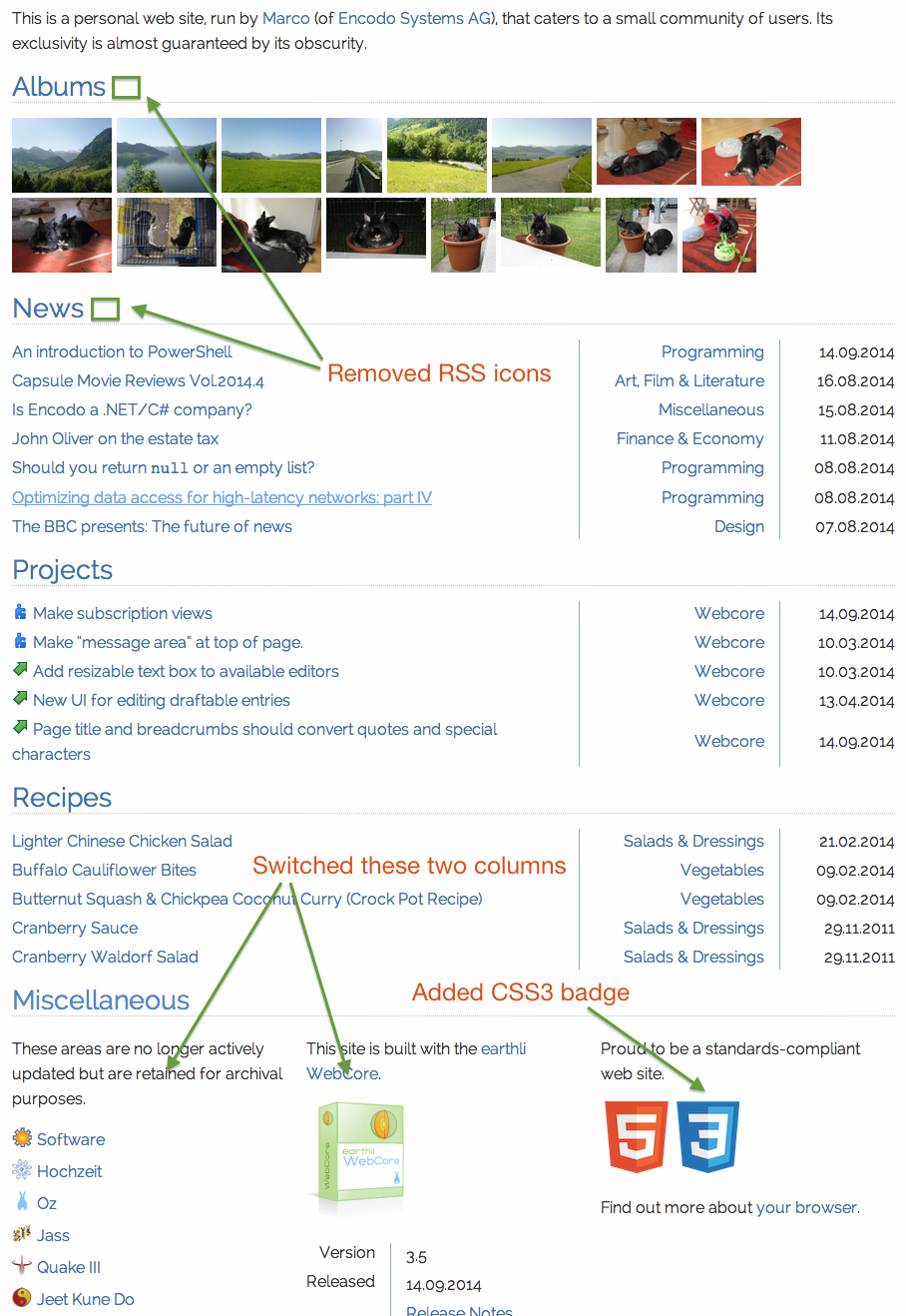
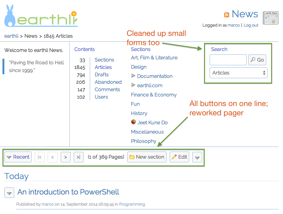 Minor changes to the news home pageThe earthli home page and the product index pages have been cleaned up, reduced and standardized. On these pages, icons have been reduced or removed—especially where they used to appear at the left, where they tended to disturb the vertical text line. On the product index page, all toolbars were combined into one single area.
User Details
 New user details
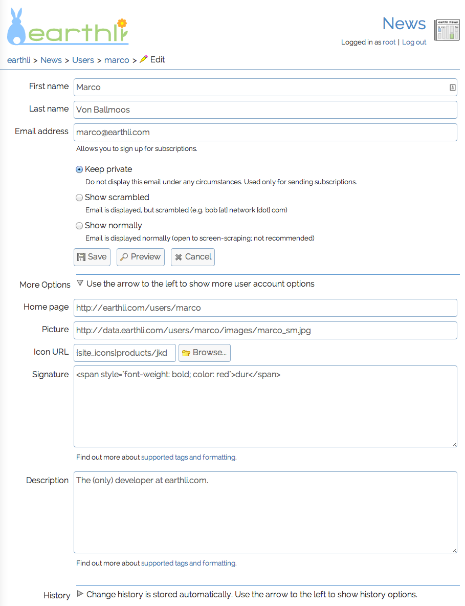
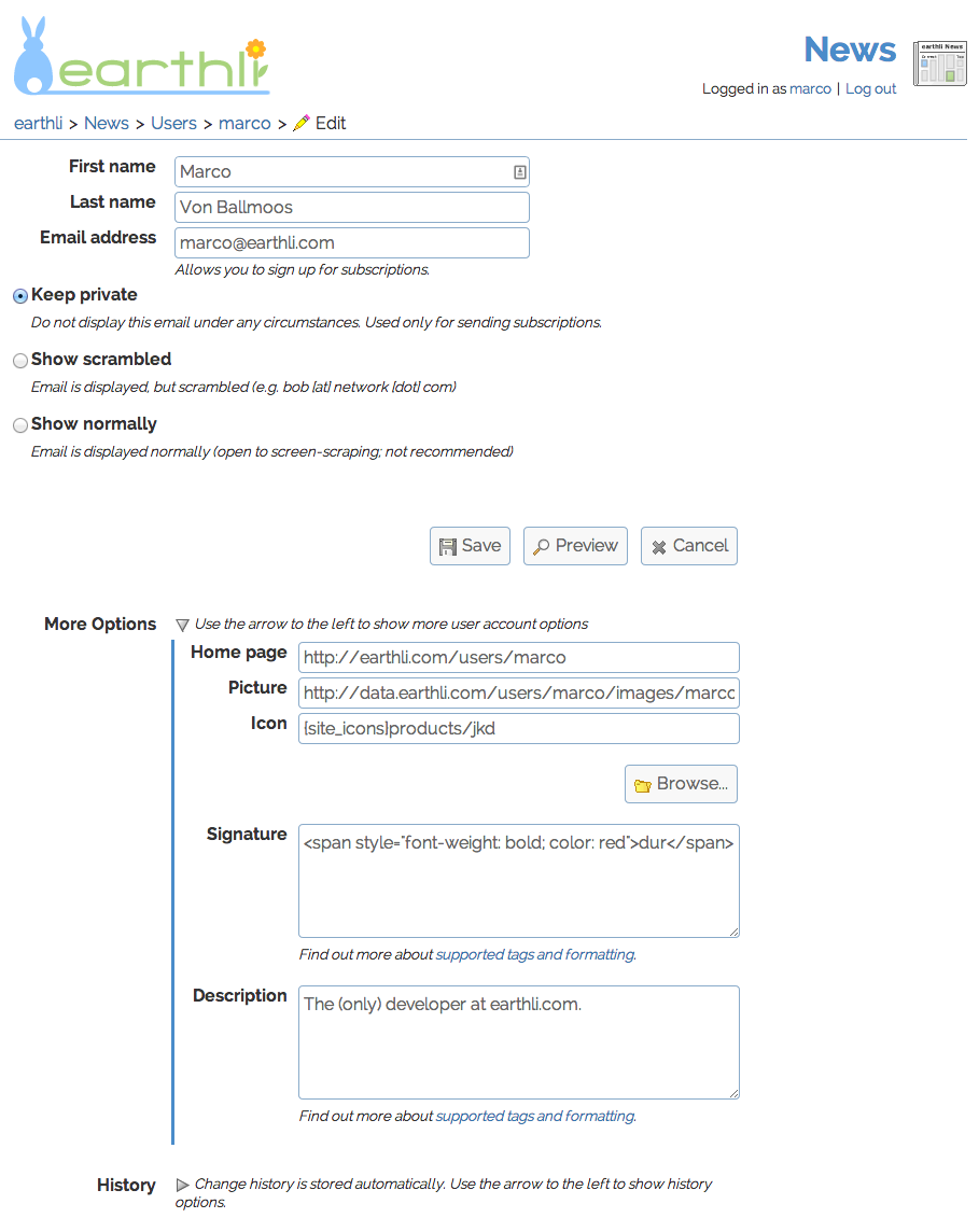 Old user detailsPages common to all products have been spruced up. It’s especially noticeable on forms with a lot of controls. These are now very consistently aligned where they’d fallen into disrepair before.
Folder Permissions
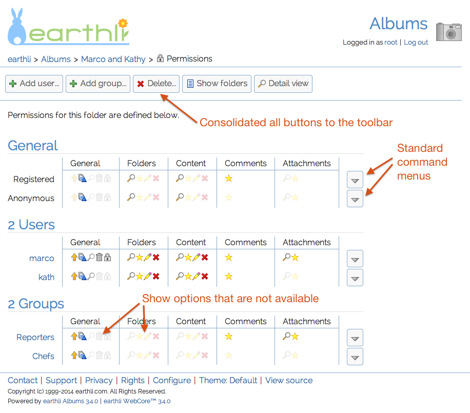 New folder permissions
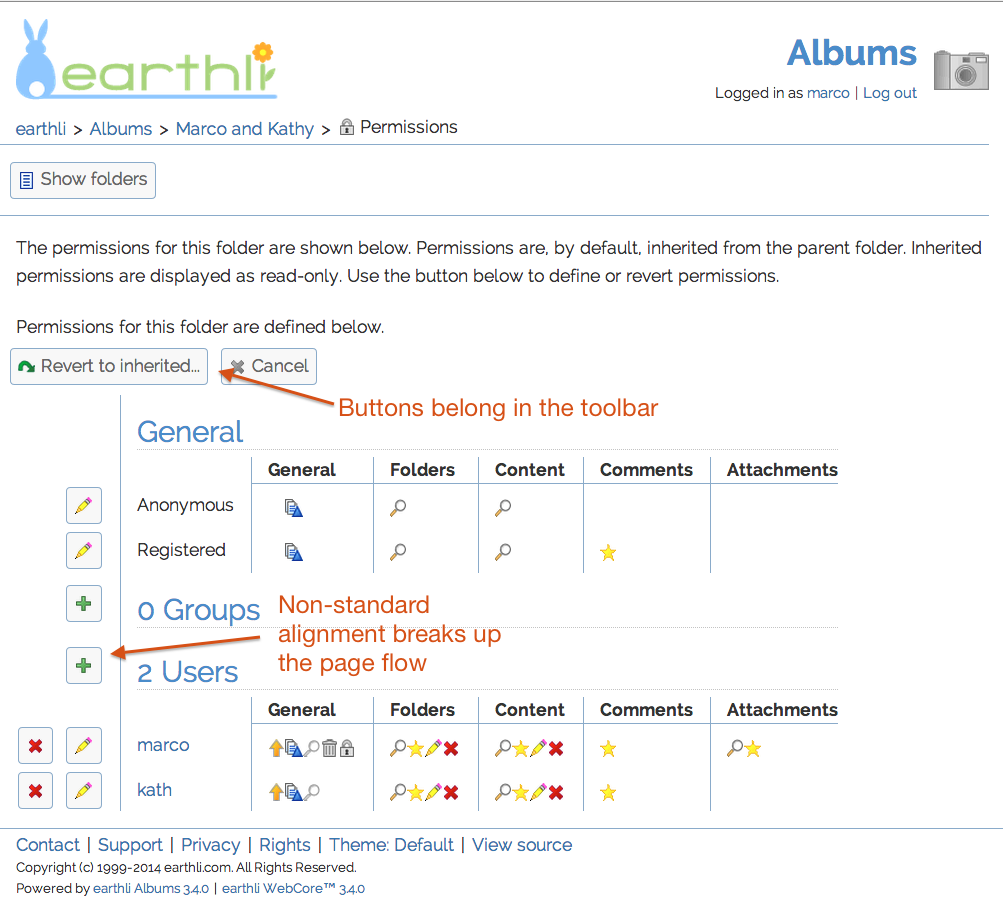 Old folder permissionsAnother common page is the permissions manager for folders. This page doesn’t look radically different at first, but if you compare the screenshots more closely, you’ll see a lot of improvements in consistency that add up to a big improvement. The toolbar was consolidated and line-specific commands were standardized.
Calendar Chooser
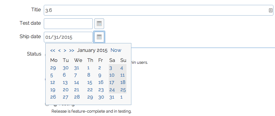 In-place calendar dropdownAnd, finally, the old, old—old—calendar-chooser-in-a-separate-window has been replaced by an in-place calendar control. It’s not rocket science, but as a regular user of this control, I’m glad to have gotten rid of the old, crufty version.
Edit Article
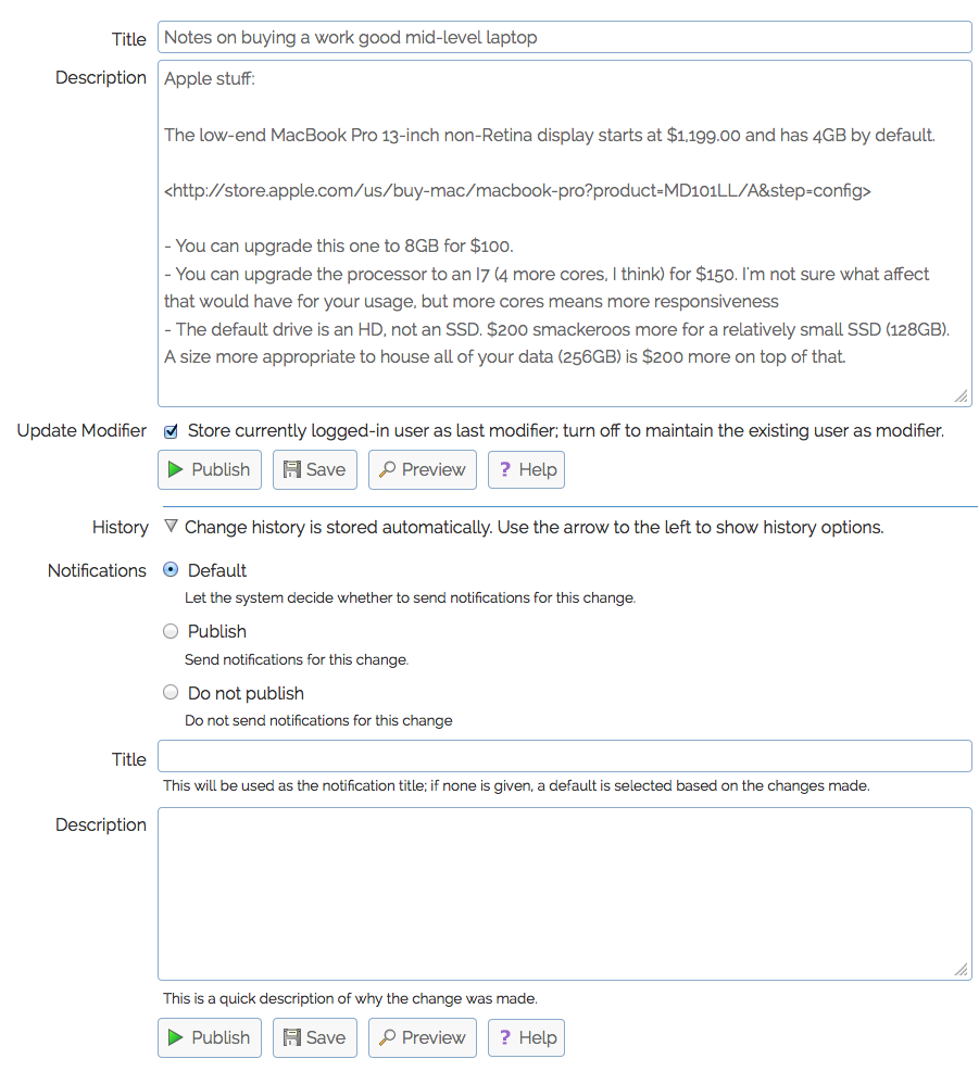 Edit article form – WebCore 3.5
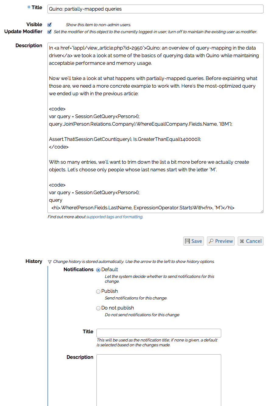 Edit article form – WebCore 3.4I put the most customization into the relatively simple article-editor, simply because I spend the majority of time there, editing blog posts. The new version makes much better use of horizontal space—without using so much that line-length detracts from legibility. As with the other forms, the edit-article form automatically picks up much better control and text alignment.
Inline Preview
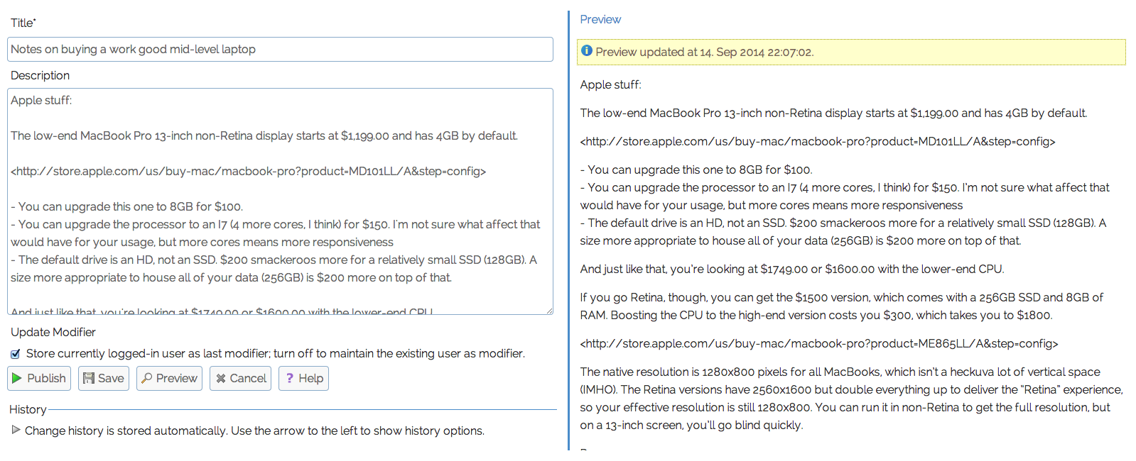 Edit article with standard preview
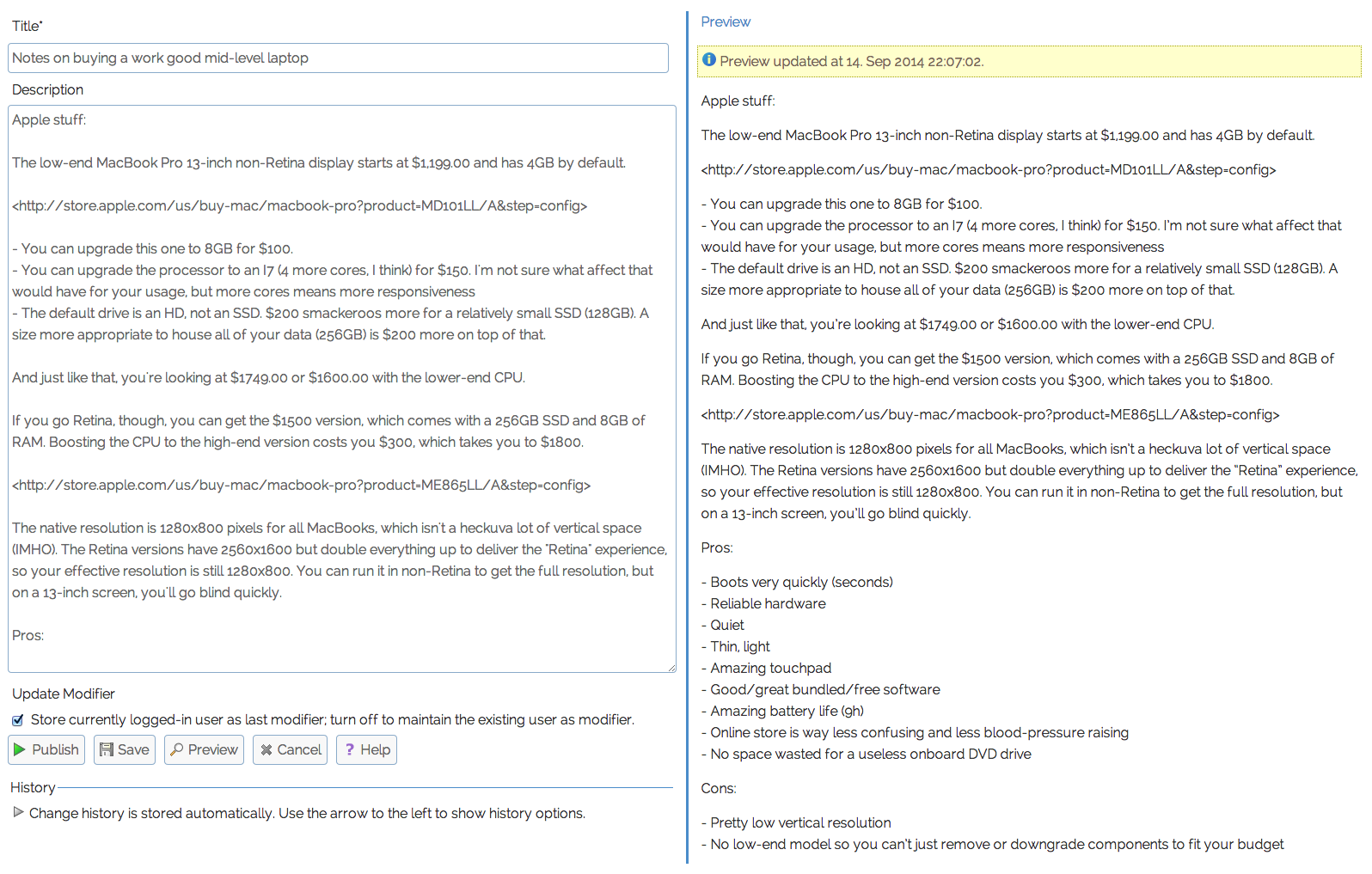 Edit article with tall previewThe article editor also includes a side-by-side and non-refreshing preview. Another Godsend for anyone who spends a lot of time editing longer posts.
Edit Job
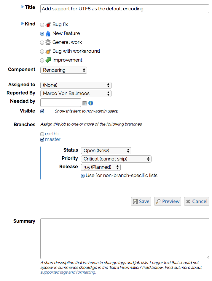 Edit job – WebCore 3.4
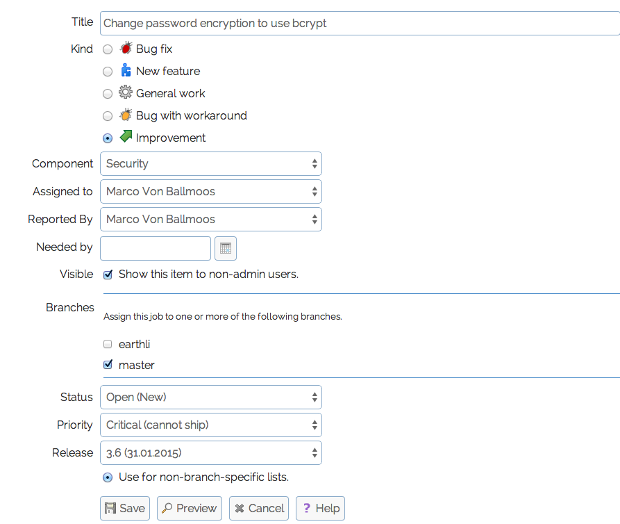 Edit job – WebCore 3.5In the earthli Projects, the job editor is one that shows a lot of improvement after the upgrade. The design is much quieter, with less jagged edges on the right to distract the eye. The code that builds this form is essentially unchanged[1]—the improvement came “for free” when I updated the stylesheets.
Edit Recipe
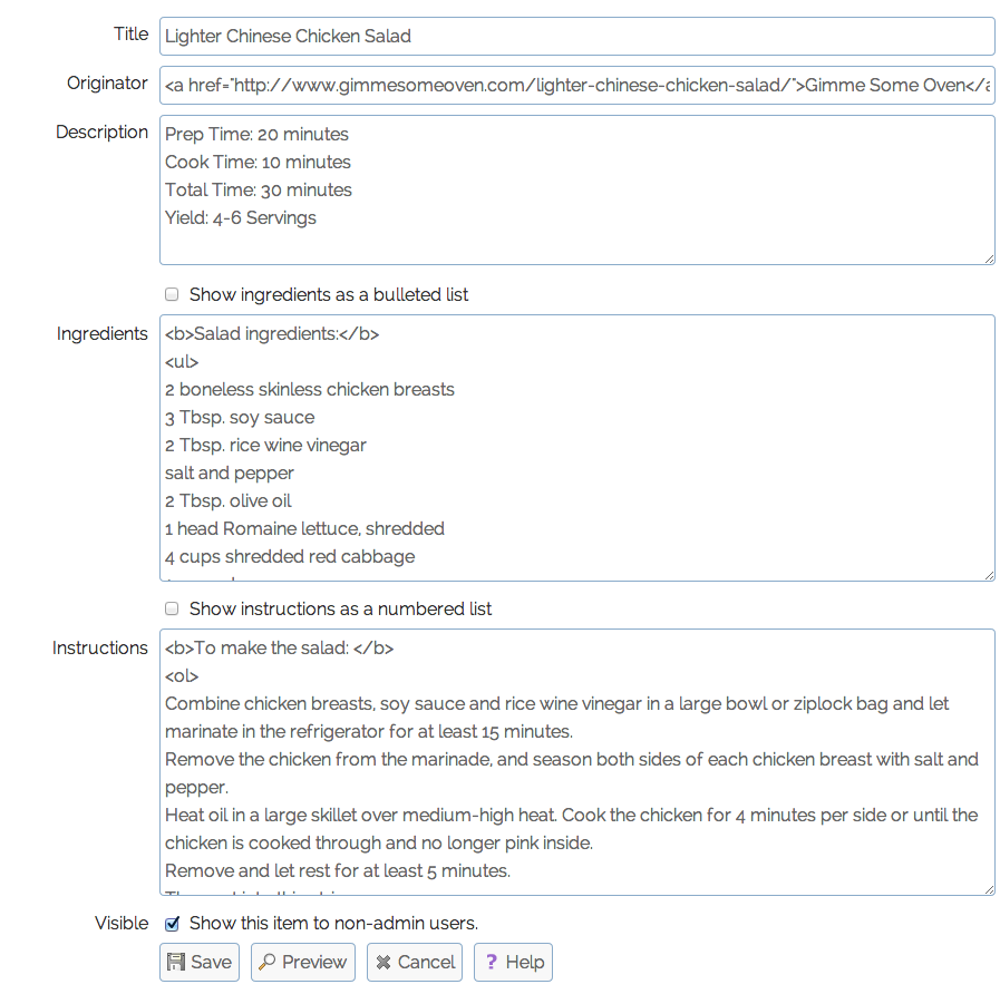 Edit recipe – WebCore 3.5Even the relatively straightforward form in the recipe editor looks nicer and automatically makes better use of horizontal space. There is no inline preview yet, but the old server-round-trip preview is still serviceable for these shorter texts.
Edit Album
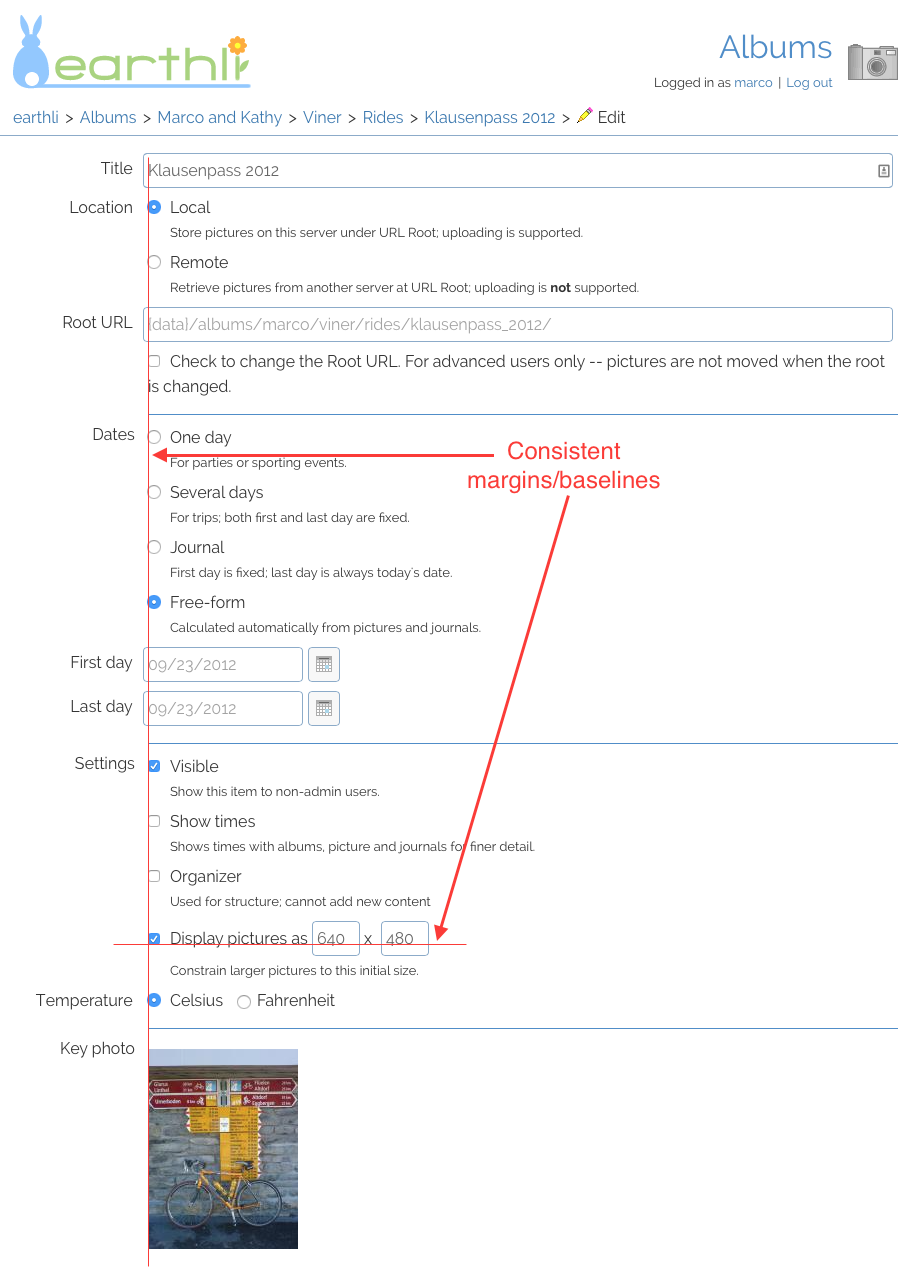 New album editorAnd, finally, the album editor shows how well the stylesheet maintains both vertical and baseline alignment for many different types of controls. Controls are aligned to an imaginary plumb line as are their labels (and descriptions for radio buttons and checkboxes). In the case of text controls, alignment to the text in the control was preferred to aligning to the border of the control itself.
Where to next?
The next natural step is to use flexbox display in many other places, but browsers are not quite ready for that yet. This is probably the last difficult CSS rewrite that I will have to make, in which layout must still be made using floating elements because too many browsers still have shaky flexbox support.
In two or three years, though, I’ll be able to just switch out the display styles and much more cleanly and easily define the form layout using flexbox than the occasionally shaky and still unevenly support margin/padding/float/relative-positioning solution that earthli currently uses.
[1] I write “essentially” because I did make some code changes, but not to the structure. I changed code to remove inline and hard-coded styles so the form could “breathe” and assume the shape outlined by the stylesheet rather than forced in the code.↩