Guardian Signup Form (30 of 73)
Published by marco on
The Guardian doesn’t have a paywall, but they now have a registration requirement. This is fine with me. I don’t browse their site regularly, but I do occasionally get links from bloggers I follow. I appreciate the job the Guardian does and am fine with being registered with them.
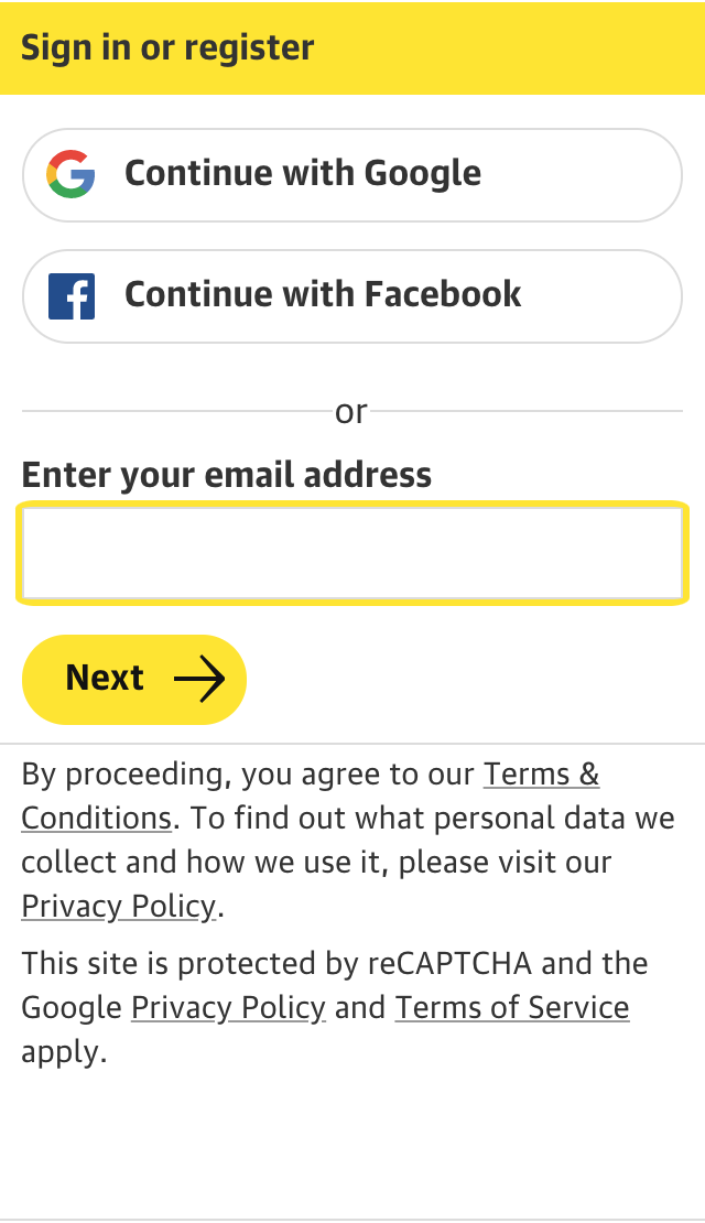 Guardian sign-in/sign-up formTheir signup form is somewhat odd and unpleasant-looking, but it’s the functionality that’s the most offputting.
I was unable to sign up with my preferred email address. I was notified of this by validation that indicated that “one of the fields was invalid” (of the two I’d filled out), but couldn’t tell me which one. It reverted me back to the beginning of the two-step process.
I assumed it was the mail address, although it appeared valid when I typed it in the form (it had a green checkmark or the text turned green…I can’t remember).
The UX here is suboptimal.
I gather the server validates more stringently than the client to prevent “fake” email addresses or to prevent people from using masked emails like the one I’d given (a spamgourmet address) because, God forbid, using one of those would give someone control over their own inbox. This is silly, as the email must be valid or the activation won’t work.
What are the design lessons?
- If you have client-side validation, then make sure that it matches the server-side validation.
- If it doesn’t match (or it can’t because the check can’t be executed quickly enough on the client), then make sure that the error message is specific.
- Vague error messages are poison; I understand that you have security concerns, but you can still tell me that it was the format of the e-mail address that you didn’t like instead of pussyfooting about with a coy “one of the fields was invalid”.
- Let people sign up with whatever e-mail address they like; if you’re having trouble with spammers and scammers, see if you can’t solve it another way, preferably one that doesn’t involve blocking people with legitimate addresses.
I ended up using a throwaway address that I very rarely check. This is fine with me. It’s just that it will be largely useless for the Guardian to get my attention, should they choose to do so.