Standing out by Blending in − Development on OS X
OS X is a demanding environment for budding applications. There are a lot of customs, rules, standards and recommendations to follow in order to integrate properly with the rest of OS. Since the OS that Apple delivers is so strongly integrated in its look and feel (you can’t change the Aqua theme without third party software), applications that do whatever they like feel somehow “wrong” and get uninstalled.
 Delicious Library (Ars Technica) reviews the product of the same name (their attention to graphic detail does not extend to their home page, which is likely to make you go blind). John Siracusa’s loving review spends a considerable amount of time trying to tease out why this “glorified list of books, movies, music, and games” still has the Mac mystique. Its base purpose isn’t earth-shattering, so why does it still make you want to download it?
There are several reasons, but they all boil down to its seamless integration into the Mac OS and clever positioning. Even the name, “Delicious Library”, is just odd enough to be intriguing. “It’s not “MacLibrary X” or anything similarly predictable”. Apple has Human Interface Guidelines for OS X. If you look at the guidelines for icons, you’ll see that the icon to the right fits them perfectly.
“If the primary function of your application is creating or handling media, its icon should display the media the application creates or views. If appropriate, the icon should also contain a tool that communicates the type of task the application allows the user to accomplish.”
The icon has a few books with barcodes on them, on top of which lies a barcode reader. This is not rocket science, but to an OS X user, this icon will “feel” just right.
The two developers behind the project are formerly of the Omni Group, makers of other extremely carefully constructed Mac OS software (like the Omniweb Browser, for example). The pedigree is good, so lets see what Delicious Library gets so right.
Installation
![]() Mac applications are typically downloaded as disk images; there is no installer. You get this disk image, pop it open and see a nice background with a single icon. There’s also usually text telling you to drag the icon to your “Applications” folder to install it, if you’re a total noob. How the hell do you distiguish yourself here? Well, instead of the standard white disk image icon, you get the image to the left.
Mac applications are typically downloaded as disk images; there is no installer. You get this disk image, pop it open and see a nice background with a single icon. There’s also usually text telling you to drag the icon to your “Applications” folder to install it, if you’re a total noob. How the hell do you distiguish yourself here? Well, instead of the standard white disk image icon, you get the image to the left.
This may just be a pretty picture; it may just be throwaway fluff if the application doesn’t provide any useful functionality. However, compare and constrast to the other two contenders for our desktops. Siracusa asks:
“Windows users, think about what your typical download and installation experience is like. How many dialogs are you presented with? What do the file names and icons look like? Linux users, when you look at the carefully laid out disk image contents in the screenshot and links above, think about how far “desktop Linux” has to come before it can even begin to think about details like [this]…”
It’s this obsessive focus on design that creates easier-to-use products that are a whole lot easier on the eyes on the Macintosh. If something is hard to use or doesn’t integrate into the platform, it gets torn apart. I know: I’m in the Mac OS X beta tester group for Opera’s web browser. It’s a constant battle explaining that you cannot have a successful cross-platform product if that means that the Mac version looks and works the same as the Windows version. Ever Firefox, an open source browser, gets it. They have a special skin which uses the native Mac APIs to render the browser UI. Windows users have been clamoring for it since it came out.
Features
So, what does the product do? It catalogs your media and stuff. Big deal. It’s a glorified database. For this kind of product, it would be tempting to throw in a whole bunch of features just to try to make it stand out. “Choosing the right features, and only the right features, is important”, but choosing the features to leave out is just as important. Present a simple face to your initial users so they feel that they understand the product. Add more stuff later when your user base tells you what they want.
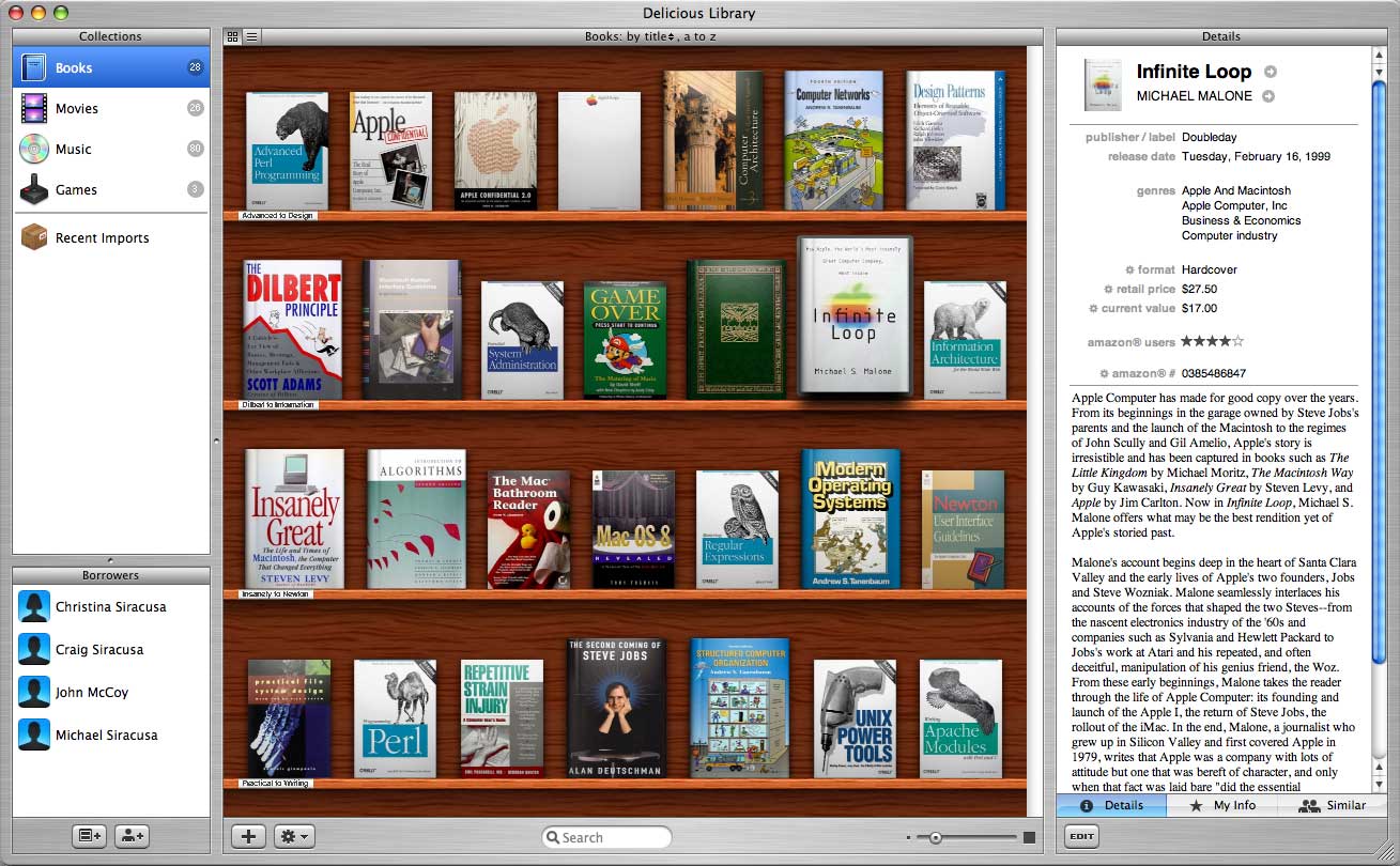 So, what kind of features do you stuff into a media application. Well, think of the kind of obsessive market you’re targeting: they want to catalog everything they own in a database. They also want to do this on the Mac, so they want it to look nice. Even realistic. To the right, you see the main (and only) window of the application.
Right away, if you’re a collector, you think “cool … I want my stuff to look like that”. And it can. The book, game, cd and dvd covers are automatically pulled from Amazon and composited with stock graphics to create realistic looking copies for your shelf. Again, they’re just using the amazing compositing capabilities offered by the OS to bring you flair you probably didn’t expect in such a mundane application. The end result makes you want to enter more data and make your shelves look better and better.
There are naturally other features you might want and the graphics aren’t always so well integrated (Amazon doesn’t always provide a good cover graphic), but for a first version of the product, it makes a fantastic impression. And I think that’s the point I wanted to make. The point is not to get you hooked on the Mac, OS X or the Delicious Library. It’s that the Mac quite frequently plays host to applications that make interesting, new impressions. I think it lies in the integration and presentation that is possible on that platform.