The Man in Blue
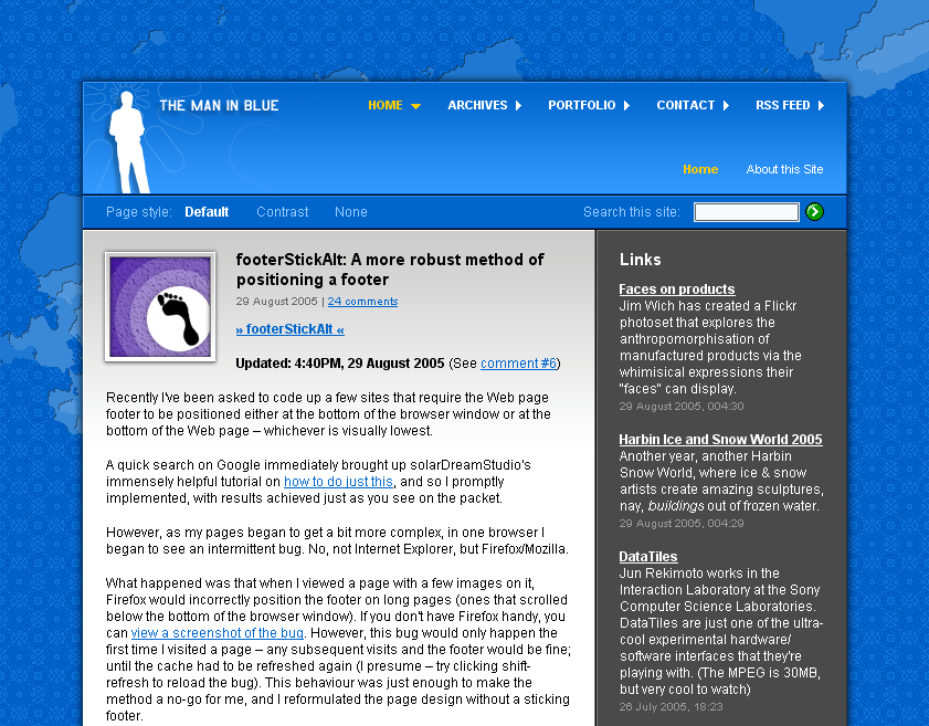 Tight, good-looking use of strong blue color. The frame around the lead-in graphic looks very good too. Note the use of an initial gradient on the article text to give it more texture. Header, navigation, content and sidebar are clearly-defined areas with their own colors. (TheManInBlue Home Page)