Obvious Diversion
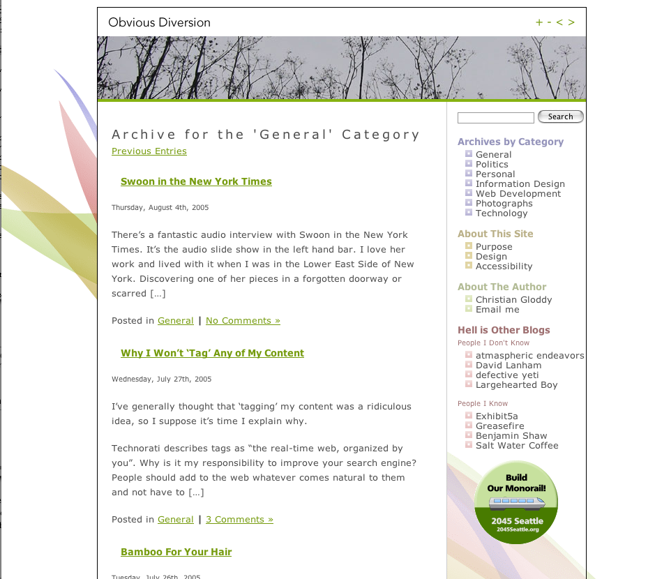 There’s not much to say here, except that sometime many colors can look nice. The menus on the right are in several shades of soft pastel and are quite harmonious. Keep it in mind as a choice for themes. Nice that it matches the big background graphic. (Obvious Diversion Home Page)