Microsoft “Live”
Published by marco on
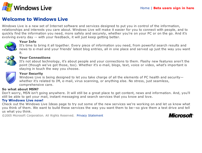 We’ve seen how firms large and small bring their sites up to speed. The screen shot to the left is Microsoft’s enchanting new Windows Live site. Granted, it looks like they’re still working on it, but let’s take a critical look at it anyway. (Not ready for prime time? Leave it offline.)
Their icons are fine, but don’t they have designers at that big old company? The content wraps around the icons in a way that was cool in 1995 when Netscape finally managed to do it without crashing all the time. The “So what about MSN?” part looks all out of place. Line and paragraph spacing are atrocious and the copyright footer doesn’t even have any spacing from the rest of the test.
Hey Microsoft! CSS is here and your browser actually supports some of it! Get acquainted with margins and padding to lighten up the site a bit and you might actually entice some people into clicking the “Beta users sign in here” link. As it stands, you might as well scrawl “HTML generated with Microsoft Word” all over it.