Office 2007 Innovations
Published by marco on
The next version of Microsoft Office looks to be quite a bit different from the last several releases, which were, on the whole, rather disappointing evolutions of the base products. Each version introduced more features without giving users any way of coping with “featuritis”—a term coined to describe Office. At one point, the menus started hiding unused features in an effort to appear smaller, but commands were still hidden in menus and the notorious nested dialog chains that hampered workflow for all but the most resolute.
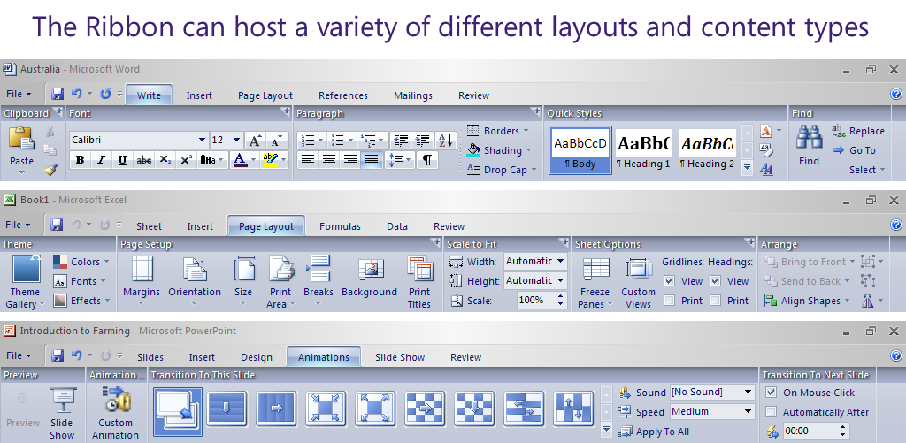 Office 2007 'Ribbons'Office 2007 looks pretty exciting in this regard: they’ve revamped the entire interface to be workflow-oriented, added text labels everywhere, used large previews of features instead of 16x16 icons and incorporated live updating for most features. Jensen Harris: An Office User Interface Blog is a good place to start to learn the latest about this version of Office. In particular, there is an article about The “Ribbon”, which replaces menus, toolbar and most dialogs with a context-sensitive tool area. Tools are grouped by the task for which they can be used rather than by some abstract functionality hierarchy.
Julie Larson-Green − Diving into the new Office 12 (618MB / 45 minutes) is a great way to see the ribbons for Word, Excel, Outlook and Powerpoint in action. The combination of context-sensitivity and attention to higher-level tasks—like applying global table formats in real-time or designing a bullet list as graphics—makes it look almost…fun. Almost all tasks have galleries of collections of properties to apply (like chart types, table types or graphic types), which are presented with large preview pictures and applied in real-time as the mouse hovers over the choices. Once a set of properties has been selected from the gallery, a user can adjust it further with more fine-grained control and then resave it back to the gallery (in most cases). Other improvements include better keyboard navigation (no more hunting for those underlines that XP took away by default) and a cool little floating toolbar that appears when you’ve selected something. It floats—it’s called the “Floatie”—right next to the selection and offers the most useful commands right where the mouse is.
For the faint of heart, there’s a Flash Demo, which offers a limited simulation of interaction with the ribbon. For the adventurous, there’s a 450MB download of Office Professional available, which includes Outlook, Powerpoint, Publisher, Infopath, Word, Access and Excel.[1]
[1] This upbeat article was written after downloading and installing the beta, but before rebooting and trying out the product. This timing is a deliberate attempt to ensure that pre-release bubbly enthusiasm is properly recorded—unsullied by any negative feelings engendered by the actual product.↩
Comments
#1 − Nice features
Marc –
i already had a look to this movie some months ago. my first impression was “oh, looks nice but will it be usefull?”. after some thinking about it i would like to get this new version asap. think this ideas will be interesting for other applications as well.
the “bad thing” is that microsoft once more did their own thing for the toolbar-system. now, where they are shiping their current toolbar-system with .net 2.0 they just started to use another system once more so component-writers can do business once copy the microsoft style. the race is started once more :-)
cheers, marc
#2 − Just tested it!
I just tried it out and am still very excited about it. Both PowerPoint and Word are worlds better than any previous versions.
Kind of … the toolbar is actually a whole area on which any controls can be laid. The “ribbon” really only works for applications with a lot of functionality and a lot of different workflows. It also only works once a lot of time has been put into researching how people want to use the program.
Many other applications—including those condsidering using the “cool new” toolbar from Microsoft—will have far less success than they expect. Even if they manage to replicate the look and feel, they won’t be able to replicate the usability with a simple copycat approach. That said, I do hope they at least make the toolkit available so that applications that do want to make the leap to using a “ribbon” can do so in a standard way.