Betrayed by Your Senses
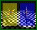
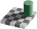
Normally, optical illusions are the stuff of chain letters and AOL home pages. Those found on the pages at eChalk optical illusions are a cut above that. The two most impressive ones are Colour perception and Colour perception 2. It’s hard to believe that there is no trickery, but, if you need to, take screenshots of the before and after to prove it to yourself.
These tests are especially interesting for designers, and especially graphic designers. On the web, not only must you remember not to make any navigation or functionality rely solely on color differences, you must also make sure your designs don’t look terrible to the average person. To find out what that means, you have to let more than just one or two people see the design—and believe them when they find that your God-given design doesn’t look nice to them. On the bright side, you can use this power for good, making pre-chosen colors—like those from a client—look better for most people by juxtaposing them with others that affect how they are seen.

