First Days with Microsoft Vista, Part I
Published by marco on
This article was originally published on the Encodo Blogs. Browse on over to see more!
Past experience has shown that, while the initial reaction to the initial release of a Microsoft product can be very good, that curve degrades with time. With early versions, replace the verb “degrades” with “plummets”. Early on, the superficial glitz has the most power to distract from the deficiencies. Vista is far from an early version, coming as it does at the end of a long line of predecessors of Microsoft’s flagship product. As it stands, Windows is over a quarter of a century old. For Vista, however, the hype machine rolled out in a manner unlike any since the release of Windows 95 was supposed to change the world.
As with that momentous release a dozen years ago, Vista arrives astoundingly late, touts far fewer features than were originally planned and purports to change the world by giving Windows users many of the features the other 5% have been enjoying for some time now. However, since the just-installed glow hasn’t quite worn off, let’s stay positive and as objective as possible. Let’s see what it actually does.
- Aero Glass
- Vista is very, very pretty. The prettiness is more than superficial, as with its predecessor, XP, which quickly dropped you back into the Windows 2000/Windows 98 world as soon as you opened something a little off the beaten path. Like a control panel. Vista has got it just right, offering an experience at least as delightful—as far as subtle effects, shading and hinting are concerned—as the current version of Aqua. Windows fade in and out convincingly, as do all manner of transition changes. The full-screen compositor releases users from having to choose between no on-screen gesturing at all and the often-jarring, ham-handed approach taken by XP. Vista wows with a lot of little things: when you select a folder with photographs in it and drag it, you see a larger “drag” icon of a folder with a couple of picture in it. Look closer and you see that your pictures have been rendered into the composition. It’s just a little thing and purists will argue that it has nothing whatsoever to do with functionality. They are wrong; it is exactly these little things that have let OS X get away with shipping a sub-standard Finder for years.
- Start Menu
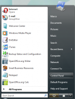 Though the in-place Start Menu has caught flack from other reviewers[1], it’s probably a godsend for those without exquisite mouse control, capable of smoothly navigating large fields of menus. The XP start menu was also just slow, so the searchable menu is a nice change. The Vista menu is much more plain looking, with a single icon on top, reflecting the currently highlighted choice. Anyone serious about quick application navigation, however, will just get Launchy and be done with it. It’s an excellent addition to XP or Vista.
- Gadgets
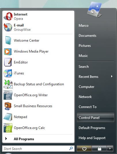
 These are small applications that live in the Windows Sidebar, showing weather, time, date and other information. The screenshot to the right shows a notepad and an RSS feed reader (though it only supports Microsoft Newsfeeds). Though some have called it distracting, with a wide enough screen, it’s a pretty nice compromise between Apple’s Widgets layer—which only displays on command—and full-fledged applications. Look for Apple to steal this idea right back from Microsoft (though an application called Amnesty already more or less does this for OS X). All-in-all, a cool addition that is actually useful and pretty easy on the eyes.
- Switching Applications
Window shuffling (Windows Key + Tab) is a neat-looking trick, but it remains to be seen whether it will be worth using. Alt + Tab shows thumbnails of each running application to help you find what you’re looking for and updates them in real-time! If you hold Alt + Tab for a while, you can watch Flash animations play in open browsers or progress bars inch forward in installers. These thumbnails also pop up above a task bar item along with a tooltip with the full application title. That it doesn’t work for minimized windows is the only drawback—is there really any reason why Vista couldn’t just keep a copy of the last bitmap it displayed here? At any rate, this is quite handy for those applications that have multiple windows open, but have less than useful window titles.
In a nod to OS X’s Exposé, click any window when you’re showing the list with Alt + Tab to go directly to that item. This is considerably easier than circling around if you miss your application (yeah, some of us have literally dozens of things open) or twisting your hand around to go in reverse by hitting Shift. 3D Shuffle also responds to clicks to select a windows, but lack any visual cue while hovering over different windows in this view. This is likely something that will be addressed in an update.
- Windows Explorer
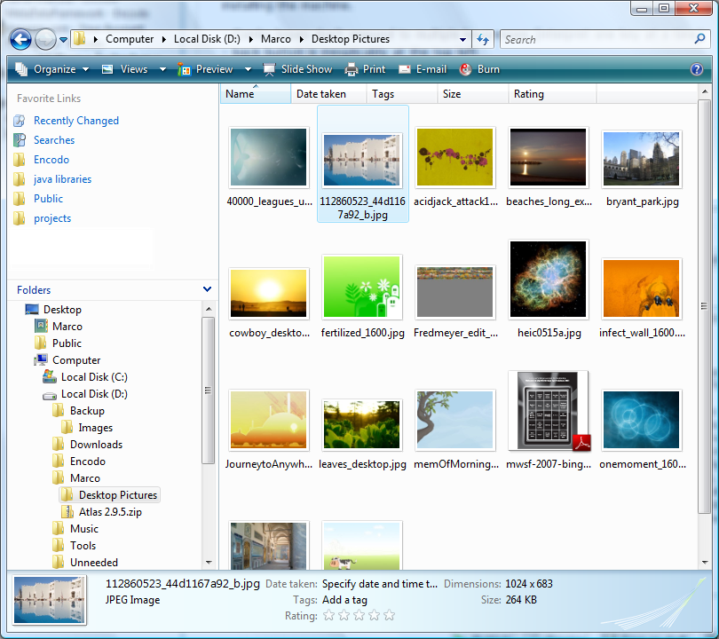
 The Windows Explorer has gotten what looks to be a worthwhile upgrade. Navigation has changed somewhat, with the “up one folder” button having been replaced with a chain of parent folders in the address bar. Click on a folder to jump back to it. Click on the drop-down arrow next to it to see other children of that folder. It seems pretty usable and extends OS X’s column view with the added ability to jump sideways through the folder structure. Again, time will tell how useful this extra functionality is.
On top of that, Microsoft bit the bullet and added the OS X/NextOS-style list of favorites on the left side. For newer applications, this also shows up in the open & save dialogs as in OS X. Older applications have the old-style dialogs without the new links, leaving you at sea if you’ve gotten used to choosing one of your favorite folders as a starting point. Similarly, the “choose a folder” window also lacks access to these links, which is a shame.
Network access is finally implemented asynchronously with a cancel button and everything; the explorer window isn’t blocked at all! It also blocks noticeably less when extracting meta-information or generating enhanced views. A view with a list of 3000 MP3s scrolled normally, displaying empty column values where it hadn’t had the chance to extract artist or album information yet. The same went for a folder with almost 3000 icons and small pictures: normal scrolling with explorer filling in thumbnails as it was calculated.
There is a lot of polish here, with a clear information area at the bottom of the window, showing combined attributes for the selection and a toolbar at the top, showing the most important operations available for the selection. This will save a lot of right-clicking for most people. Rename a file and only the name—not the extension—is highlighted. Adjust properties for a shortcut and you get a drop-down with potential matches. These are little things, but they’re nice and should make users more efficient.
At any rate, the explorer is much, much better than that in Windows XP and reassuringly better than the usability nightmare that shipped with the first beta of Vista. So far, it’s my primary file browser, unlike in XP, where I switched to xPlorer2.
That ends part one, which covered user interface impressions of Microsoft Windows Vista. See First Days with Microsoft Vista, Part II for impressions of installation, networking and security.
[1] On general principle, in at least one case: Vista first look: Bugs and confusion by Thomas C Greene (Register)↩