Improving Online Readability
Published by marco on
If you spend any amount of time reading online, you know how difficult it sometimes is to get the text into a format that makes for comfortable reading. All the more so for those doing their reading on portable devices. Web sites have several tools at their disposal to ease both online reading and printing:
- Offer a printable stylesheet that is used when the browser prints the document, so that advertising, comments, and other garbage are left out, leaving only the text of the article.
- Offer a “print” view, which takes the user to another page from which the aforementioned garbage has been removed.
- Offer a “single page” view, which shows the entire content of the article on a single, scrolling page rather than broken up into mini-pages.[1]
Though many sites offer one or more of these fine, paper- and eye-saving tools, many do not. To the rescue ride the following two tools:
- PrintWhatYouLike lets you enter a URL and then slice and dice that page to your heart’s content. Tools include “isolate”, which removes everything but the selected content and “fit to width”, which removes width-restrictions from the selected content.
- Readability is a Javascript bookmarklet that you can easily add to any browser. From the site, you can configure some basic settings like style, font-size and margin-sizes before you create the bookmarklet. Armed with this button in your browser, you can browse to the page you’d like to print, then press it to transform that page into a marvel of readability (pardon the pun).
As an example, here’s a simply atrociously formatted page from the New Scientist[2]; as you can see, the left margin is non-existent and half the page is consumed by advertising and headers that are distracting for online reading and waste paper when printed.
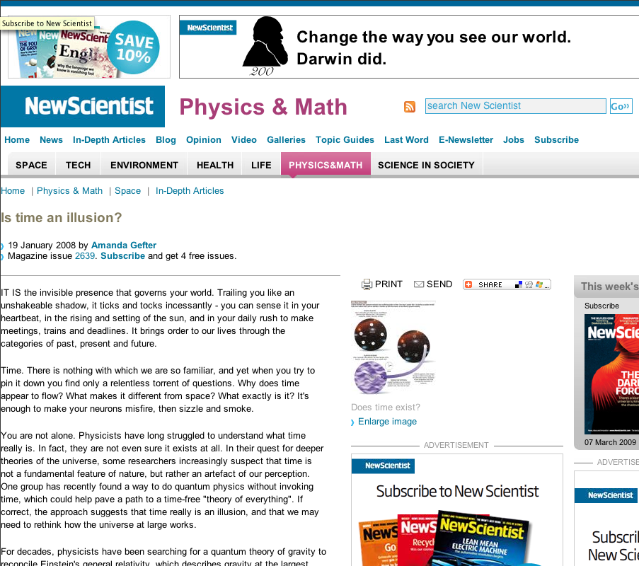 New Scientist Article – Before
The screenshot below is of the page above in the PrintWhatYouLike interface after a few clicks have isolated the content, widened it and removed some unwanted text. With the “remove” button, you can also easily zap advertising that is embedded in the text of the article itself. It’s actually kind of fun to re-shape the page to your liking.
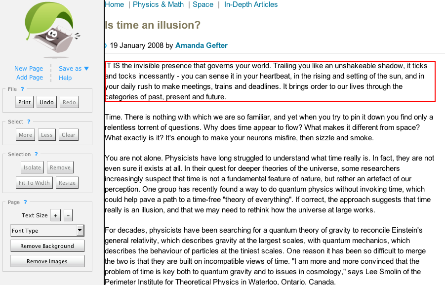 New Scientist Article transformed by PrintWhatYouLike
The screenshot below is of the page above after having pressed the magic Readability bookmarklet. Without any user input other than your having set your initial preferences for style, font-size and margins when creating the bookmark, Readability automatically creates this wonderfully legible version of the page that is eminently easy on the eyes.
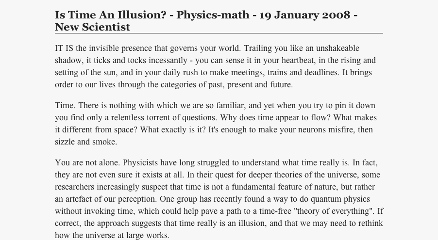 New Scientist Article transformed by Readability
I’ve found that I use both tools; I generally try Readability for online reading, but use PrintWhatYouLike for a smaller font when printing. Readability doesn’t always work, though it often does a good-enough job; you may have noticed that the author’s name was dropped in the example above, though that hardly seems important for reading. A simple refresh of the page restores it to the original version. Readability works with a single button-click, which is great but not fun; PrintWhatYouLike requires much more interaction, but is kind of fun. Both tools belong in your arsenal against unfriendly formatting online.
[1] Sites ostensibly break up single pages into multiple pages in order to increase ad-impressions.↩
[2] The article itself, as with so many others on that site, was well worth reading. Their formatting has gotten better, but it’s historically awful: they used to have a 7pt default font.↩