Tufte Weeps: ABC News
Published by marco on
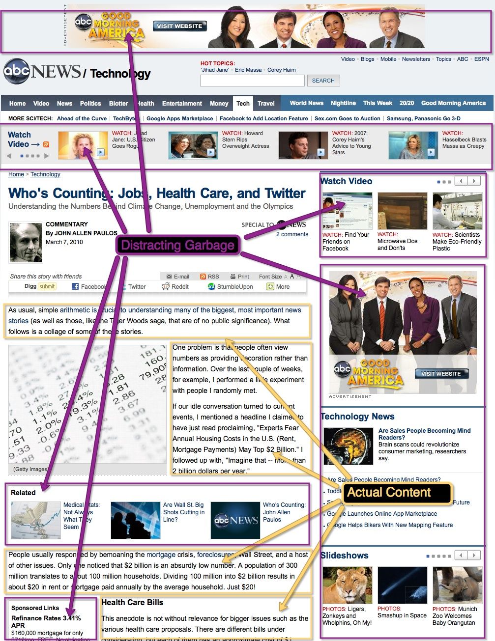 A rather interesting article about innumeracy on ABC News was almost completely overshadowed by a layout dominated by advertisements for other products also available from ABC. Anyone happy to read content for free online should also be prepared for a shameless onslaught of self-promotion, but does it have to be so ugly? The page is broken into dozens of blocks (listed below), which seem to only coincidentally line up or share a common style.
Take into account that most of the blocks are independently animated and the overall effect is dizzying. As you can see from the screenshot, the article ends up split into four nearly independent blocks on the page—and is then split into four similarly delightful pages. As with most online articles, the printable version is a safe refuge. Or you can use the Readability bookmarklet to clean things up.
List of page blocks
- Banner ad
- Site banner (with search controls & some vestigial top-level menus like “ABC” & “ESPN”)
- Menu bar (pretty comprehensive, though with a few “main” links added to The end of it, like “Good Morning America”)
- Other articles in this section (represented as a thin, horizontal bar and flying in the face of all design and usability trends)
- Finally, the article itself
- Then a toolbar for the article (sharing, print, email, etc.)
- A block containing more related links (with thumbnails!) cutting the article off
- The article continues
- Floated in on the left is a block with “Sponsored links”
- A comments area
- Another block below that with “More Coverage”
- A Web 2.0-style footer with most of the menu repeated in static “fat footer” form
- Dominating the right-hand side are several blocks:
- One with even more related links, this time videos
- Yet another ad for “Good Morning America”—which smacks of desperation
- Another block with more links from this section
- A block with completely unrelated slideshows
- Another sharing (e.g. Facebook) block (as if the article toolbar above wasn’t enough)
- A block of “Most popular” links
- ESPN Headlines
- A Digg applet showing “Most Dugg Stories on ABC News”
- Some advertisements
- More “sponsored links”
Sweet Lord! Almost maximum redundancy achieved. I didn’t even have the heart to try to validate the page. Talk about a page designed by comittee.