Updated my Curriculum Vitae/Resumé
Published by marco on
 I am in no way looking for a new job. I’m very happy at Encodo. However, I hadn’t updated my project list or resume format since 2002. I’d also seen a lot of resumes cross my desk when we were hiring last year, with some good ideas and some bad. I wanted to try out some ideas I had to improve formatting, legibility and information density/comprehensibility.
There were a few main areas that I thought I could improve in the “standard” resume format.
I’ve got a strong first draft, but I’ll be tweaking it again after letting it sit for a bit. You can check out the current version here: Resume 06.2016 (PDF)
Requirements
What problems am I trying to solve?
- A plain text listing of skills leaves a lot to be desired. How competent are you in that skill? How many years have you used it? When did you last use it?
- Many IT jobs are project-oriented, so listing employers isn’t sufficient. On the other hand, if you list a lot of projects, it’s hard to see how long you worked at an employer. How long was a project? Did you ever work on overlapping projects? Which roles did you have in the project? Did those roles change over time?
- If you’re a bit long in the tooth and have a lot of projects and/or employers, the standard format doesn’t fit very well, either. Information is spread out and difficult to process as a whole.
Ideas & Solutions
I’ve come up with some ideas for answering these questions at a glance, using a combination of responsive text and charts.
- Show items in a grid instead of sticking to a strictly top-down format, which wastes space and leads to long lines that are hard to read.
- To address career length, summarize on the first page and list projects on following pages.
- Use charts to summarize long lists/grids.
- Use the X-Axis of the chart to indicate chronology (years)
- Use colors to indicate roles in a project or competence level of a skill
- Use striped colors to indicate multiple roles in a project
- Each project or skill gets a bar from start to end of project or use of skill
- Overlaps in the chart indicate working on multiple projects at once
- A change in color or striping indicates a change in role
- Make sure that generating a PDF or printing the document works well and doesn’t waste paper
Armed with these ideas, I came up with a responsive set of CSS styles. On top of that, the print styles are configured to create a very pleasing printout, in both portrait (PDF) and landscape.
Skills Timelines
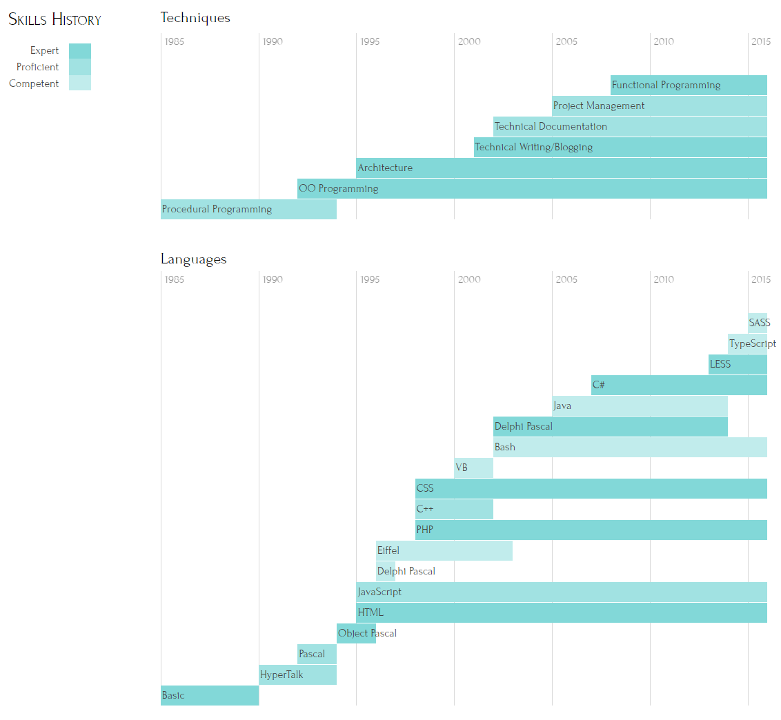
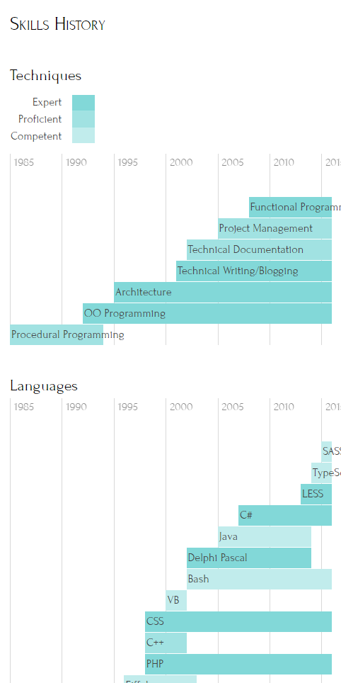 Since I started programming in 1985 (more or less), I started all of my timelines with that year. To the left, you can see a full-width version of techniques and languages, with the legend and main title to the left of the two charts. To the right, you can see that the responsive, highly compressed version is still very legible and useful, with title and legend above. The intensity of the color in the bar indicates skill level, so you can make sense of the chart even if the legend has scrolled out of sight.
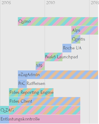
Projects Timeline
The projects timeline is very similar, starting at the same year so that all charts are consistent. As indicated above, the overlap and coloring/striping nicely shows simultaneity and roles. The legend is again to the left.
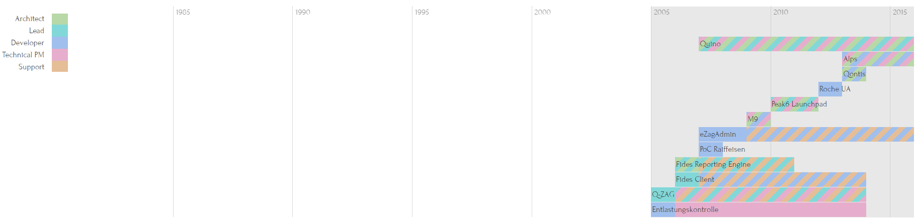
I’m not quite yet perfectly happy with the striping because it’s more difficult to see which roles are actually involved in a project, but it’s a start. In the closeup, you see the coloring a bit better, but without the legend, it’s much harder to remember what’s what. Still, it’s pretty and formats quite well, even for mobile devices.
 Encodo Projects Timeline (Detail)
So, as of June 2016, I’m more of less up-to-date with my work history. Not only that, but because the format is very declarative and uses semantic HTML, I have much more incentive to keep it up-to-date.