Fielmann: an online-store safari
The Fielmann eye-ware online store looks very nice. I’d bought glasses at the branch in Winterthur. They were great, with really good people with good advice. They have excellent prices. Their online prices are very good as well. They set me up with an account with my prescription, so I could order more contact lenses anytime.
Finding the online store
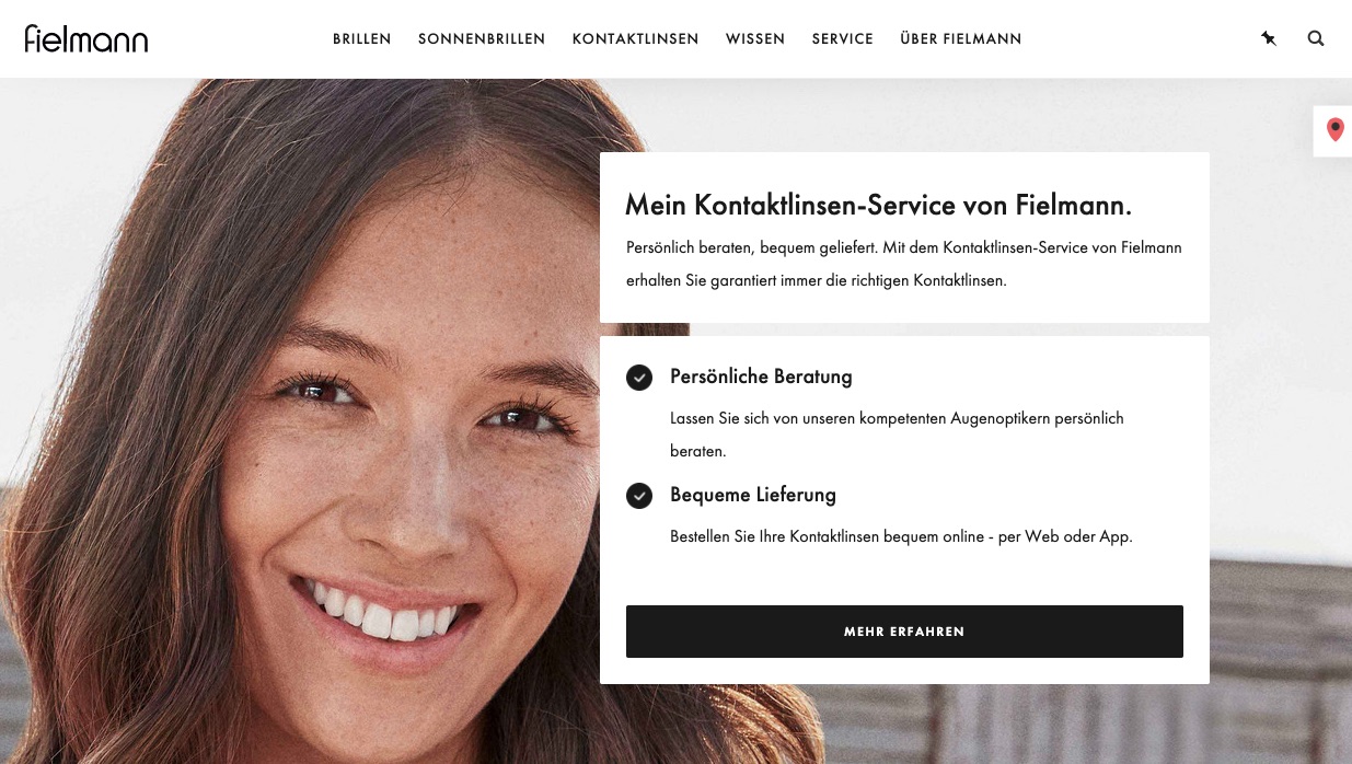
I returned to the site recently and found it to be very nice-looking, but considerably less friendly. It was subtly pushing me to use the app instead of the web site. It did all it could to keep from finding the online store from the web site. Look at this landing page:
When I clicked “Mehr Erfahren”, i was scrolled down on the same page.
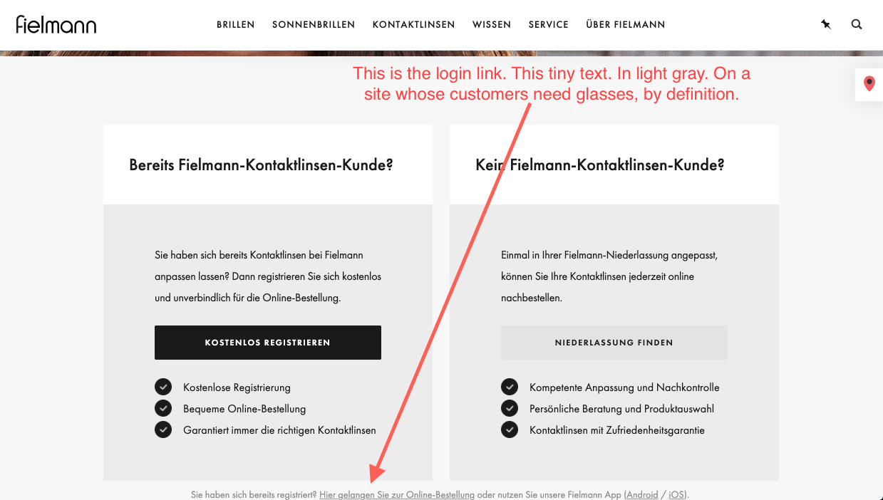
There, I was still confused about where I could log in. It’s not at the top of the page, and here I can only create a new account, for free, but that doesn’t help me. I know I already have an account; how do I log in? The only other prominent option is to find a store, which is absolutely not what I want. I’m at their store. I just want to order contact lenses from it.
Do you see it? It’s at the bottom, innocuous and written in light-gray text on white? You know, on a web site that services customers who all have trouble seeing, by definition?
That’s the link.
Needful Things[1]
I jumped to the store and was able to log in. It’s a completely different site, relatively well-hidden. I felt like I was ordering contact lenses from the Silk Road on the Darknet.
The store itself is odd. Instead of offering products from which you can select, it just has a pre-selected shopping cart for you. You can add their suggestion to the shopping cart—or you can fuck off.
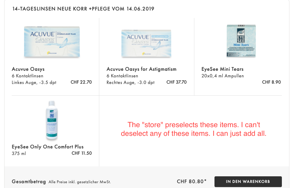 Pre-programmed and unchangeable shopping cart
So I added the pre-selected products to the shopping basket and removed the items I didn’t want. I wonder how many people do that? I suppose this trick works quite well for their older, blinder customers—those that are able to find the site at all, obviously.
Having another go
When I started writing this article, I went back to verify that it really was hard enough to navigate to warrant a rant about design.
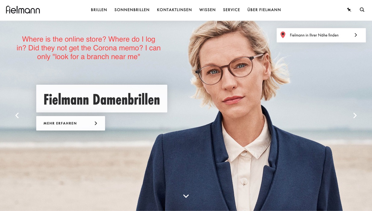
As proof, I admit that I can no longer figure out how to get to the landing page at the very top. I clicked everything that made sense and none of it navigates there. I am fluent in German. That’s not the problem. The Fielmann site is just very non-intuitive.
So here’s the main home page. Where is the online store? Do they even have one? They really, really want me to find a “branch near me”. Have they not heard about COVID-19? Their stores aren’t even open, as far as I know.
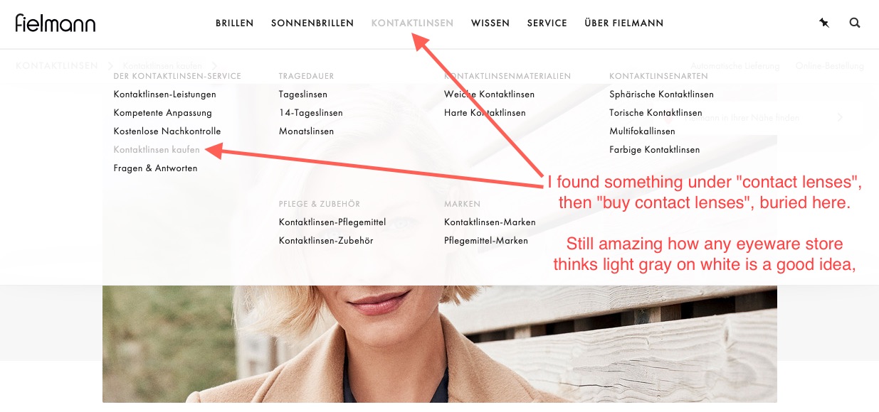
I looked in the menus and found a link for buying contact lenses buried quite well. It’s like they don’t want you to buy anything from their site. Or they probably want you to download the app so they can pester you with push notifications.
At least they’re consistent with their design. With its light-gray, tiny fonts on white backgrounds, the menu is positively hostile to their primary customers: people who can’t see that well.
That was only the first step. I’m still not at the store. I’m on the “buy contact lenses” page. Now I get to scan the page to find the “Order online” link all the way on the right, in a new ad-hoc toolbar, of sorts. Since I navigated here by clicking “buy contact lenses”, it’s an absolute feat for them to place the only worthwhile button in the least-noticeable place on the screen. I wonder if they design secret rooms in first-person shooters in their spare time?
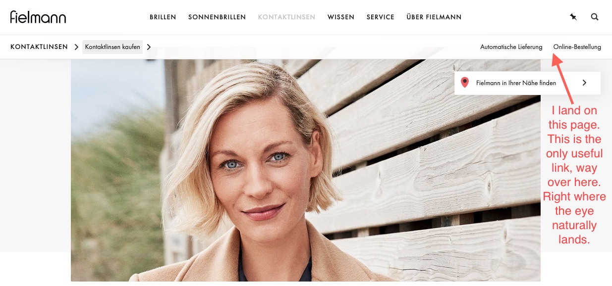 First step to getting to the store
After clicking the “order online” link, I land on another page that looks nearly exactly like every other page I’ve already been on. I do appreciate that, once I’d expressed an interest in contact lenses, they stopped showing me stock photos of pretty people in glasses and…just started showing me stock photos of pretty people? Why is 90% of the page a hero picture of someone presumably wearing contact lenses, which I can’t tell from the picture, because that’s the point of contact lenses.
Anyway, now the “order online” toolbar button (?) is highlighted. I must be here? Lemme scroll down…
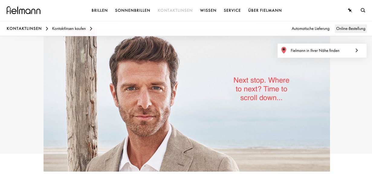 Online ordering: time to scroll
After scrolling down, I’m finally at a very similar—but slightly different—registration page from the one I’d found earlier. The REGISTER and FIND A STORE parts are still very prominent, but now there are two blurbs indicating the store’s URL, one at the top and one at the bottom and this time in black-on-white text, which feels like somebody must have fucked up. This is almost too easy now.
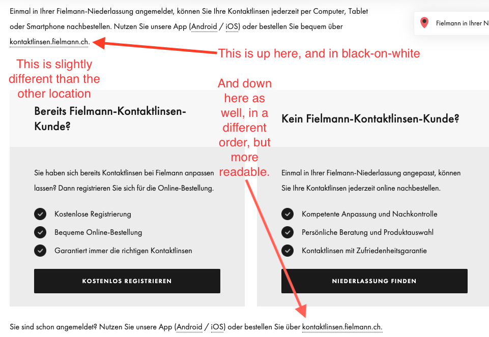
It’s almost like Fielmann is ashamed of their store. They seem to assume that they have no returning customers because I can guarantee you most of their customers create a new account every time and then painstakingly search out their products, squinting at the tiny writing on the side of their old contact-lens boxes to try to figure out what they need.
Either that, or they just order whatever Fielmann puts into their shopping cart and trust in God.