Square parentheses are not a good idea
Published by marco on
For years, programmers have been searching for the one, true, perfect font for code. They keep making changes and coming up with dozens, if not hundreds of new fonts. Most of these are fixed-size, but some are proportional. Some have extra ligatures for common combinations, like ≠or ≥. Some look cursive, which I suppose is a matter of taste.
I saw one recently in a video presentation that seems like a big step backwards.
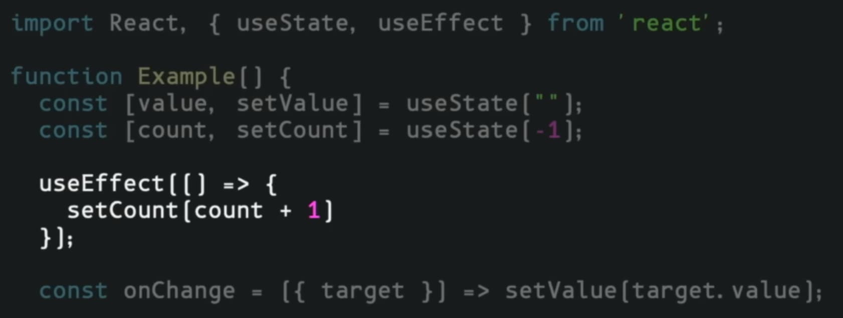
What is the point of making parentheses look so similar to square brackets? This is a silly aesthetic choice.