Scrollbar hate
Published by marco on
What happens when you hate scrollbars so much that you forget what they were for in the first place?
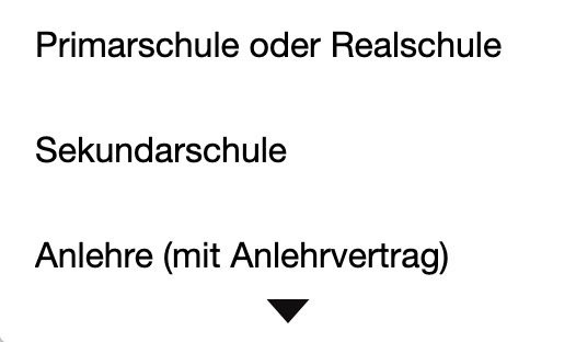
You end up making a dropdown chooser that looks like this:
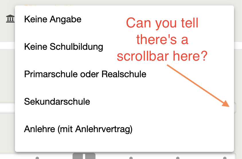
The drop-down is for “level of education” and, for a few seconds there, I couldn’t figure out why the highest level of education available was Anlehre (“Apprenticeship” in German). If I hadn’t been familiar with the content, I wouldn’t have suspected that there were more entries.
Yes, you can see that there’s a bit more whitespace under the last item than before the first item, once you know what to look for. In the good, old days, though, we had an ugly-ass scrollbar that indicated unequivocally that there were more items in the list than just those shown. We have lost that ability with our new and improved UIs.
Instead of showing the entire scrollbar, the UI could include a little down arrow, perhaps on a non-client millimeter of vertical space near the top and bottom of the control. There’s space for it, at both top and bottom—you wouldn’t even have to add any space. Just include a little triangle at the top or bottom, perhaps centered or perhaps right-aligned, to indicate that there are more items.