Google’s trying too hard to be cool
Published by marco on
I had the following video in my queue recently,
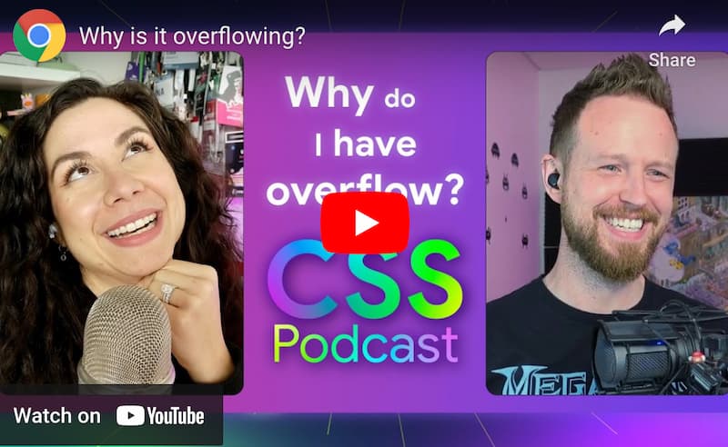
Why is it overflowing? by Google Chrome Developers: Una Kravets & Adam Argyle (YouTube)
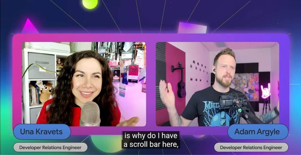
The following is not a comment on the usefulness of the information in these videos, but on the presentation, which I found so distracting as to make me stop watching. If the poster for it has changed, then here’s what it used to look like.
I dunno, it’s just too many colors and too much extra content and … too much stuff before I get to find out the answer to the question posed in the title.
The backgrounds of Una and Adam’s offices look like an AI-generated background prompted by “cool gen-z office yolo”.
 Una and Adam looking like they're in PeeWee's playhouse
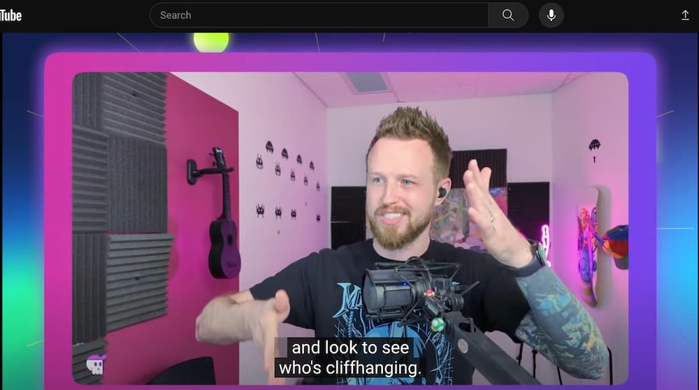
I mean, Adam is always a bit over the top, but he positively looks like a cartoon character here. I’m wondering how many filters they’re using.
 Adam looking like he's an AI-generated cartoon character
Anyway, these people are fine. They’re smart. They’re absolutely professionals in their field. They also look like they’re characters in a Saturday Morning cartoon—for those of you who even remember what that was.
