
Fielmann’s online store continues to be a debacle
Fielmann is a vendor of eyeglasses. Their stores are great! The people there are super-friendly and I’ve gotten nothing but great, well-fitted glasses from them. Their prices are absolutely fair and their customer service is top-notch.
However, their online presence is … not good.
Navigation debacle in 2021
Fielmann is also a repeat offender in terrible usability. I wrote about them in Fielmann: an online-store safari, where I described their nearly deliberately obtuse navigation.
Online-account madness
Somehow, I never wrote about how poorly their onboarding process was for existing customers when they merged their online contact-lens store into their eyeglasses store. Spoiler alert: there was none. I finally figured out how to merge my accounts and was able to order contact lenses from the main/combined store but it took several attempts.
This time, I was told that the account that I’d created no longer existed. My account at the old contact-lens site was still working but it only logged into what was very clearly a dead digital storefront. Instead of even trying to rescue my account, I just created a brand-new account, giving up on all of my order history and having to copy my lens product over by hand.
This is an international company with a large presence in the DACH region. This is after years. They’re just utterly incapable of managing their user accounts and handful of web sites.
Criminal font choices
Let’s take a look at how it has decided to design its order page.

Do you see how much whitespace there is? Do you see the giant padding in the “Bestellübersicht” (order summary)? The fonts are tiny in the breadcrumbs, in the fields, and in the summary. This is for a store that sells eyeglasses. Their customers—by definition—cannot see very well.
What’s the point of all of this nonsense? There is more than enough room for much more accessible fonts.
LacklusterIncompetent validation
They’re not only bad at accessibility but they’re also terrible at basic UX. There is no client-side validation, even though all browsers off that for free these days. I usually avoid checking any boxes unless forced to do so. I suspected that I would have to select the second one, but there was no visual indication that this field is required. On submission of the form, I initially didn’t see any change. The screen only scrolled slightly to bring that field more into view, leading me to suspect that this was the field that needed to be checked.
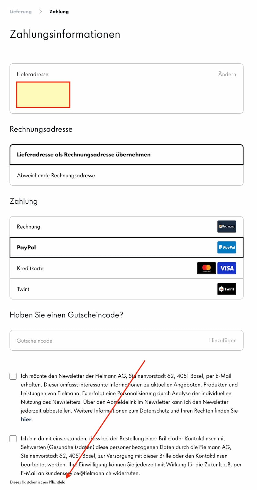
It was only after reloading the page and submitting again that I noticed the tiny, poorly aligned, and utterly innocuous error message thrown below the field like an afterthought. I added an arrow to the graphic to help you out. The screenshot below shows a closeup.
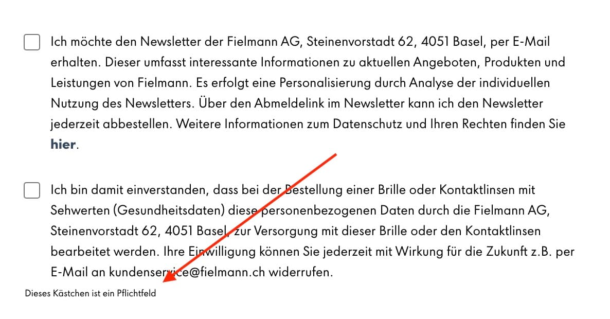 Closeup on the tiny validation message
“Dieses Kästchen ist ein Pflichtfeld [This checkbox is required]”
This is absolutely ridiculous and almost deliberately anti-accessible.