Opera 9.0
Published by marco on
 Opera Home Page
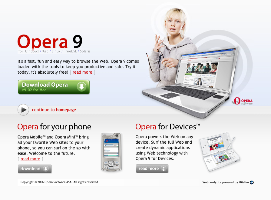
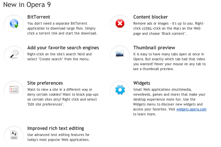 Opera 9.0 New FeaturesOpera continues to improve their site, showing that standards-based design can be fast, clean and elegant. Having recently reviewed the Firefox 2 home page, it’s hard to say who’s stealing from who here. Firefox went with the darker silhouette, while Opera opted for the “girl of indeterminate age”. Both have the big, green download button (a good idea, drawing the eye to it), but Opera has nicer product layouts, with big, Apple-y graphics. Digging further into the site reveals a clean, white/light silver layout now consistently used throughout all areas of the site (which is also considerably bigger than Firefox’s site). Notably, they’ve finally settled on a single, coherent system of icons for their products and sprinkled them liberally throughout the site, to act as way-finders for the different features.[1]
As with Firefox’s site, Opera’s previous approaches to rolling out a new site have been a bit slapdash, with the user quickly discovering areas that were still using older themes. Now, with the exception of the community pages, the more open and whitespace-friendly look is everywhere.
[1] As an aside, Opera’s feature set is just fantastic. Developer tools are still conspicuously absent, but otherwise everything’s integrated. Features like ad-blocking are superior to anything else out there and there’s none of the “shopping for extensions” you have in Firefox.↩