Spolsky’s Choices
The article, Choices = Headaches by Joel Spolsky, starts with the following screenshot of Microsoft Windows Vista:
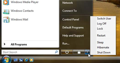 Vista 'Off' Choices
From there, he launches into a diatribe on a surfeit of choice. It’s pretty well-written, as usual from Mr. Spolsky, but somewhat poorly aimed, also as usual from Mr. Spolsky. The basic premise is a good one: don’t provide more choice than your customers know how to deal with. Provide just enough and no more. Extra functionality should be available to those who need it and no one else.
His analysis is spot-on, but he fuels it with astonishment that Microsoft would create such a monstrosity as the popup menu displayed above. In the end, he narrows the menu down to one feature, a “B’bye” button, with which the user can indicate that they are leaving the workstation. This locks the user’s account, making the system ready for another login (obviating the separate “Log Off”, “Lock” and “Switch User” features above). System settings determine when the machine automatically enters “Sleep” or “Hibernate” mode. “Restart” is deep-sixed because nobody really needs it (it’s only really required by installers, which provide it anyway) and “Shut Down” similarly because why would you ever not want to Hibernate?
In reality, the “Shut Down” function is necessary because most non-technical users (which is most users) need to know that the machine is off. Perhaps they can be weaned off of this dependency, but for now, it’s still necessary in order to keep support calls down. All the other stuff Spolsky said makes sense though. “Shut Down” is a dumb name name, though, so Microsoft should just change it to “Turn Off”. The “B’bye” feature above could be realistically named “Take a Break”.
However, Spolsky’s sputtering rage is completely unjustified in this case. Take another look at the Vista screenshot above, but imagine it without the popup menu. That’s right: Microsoft already did this analysis and came to the same conclusion. The little arrow on the right provides a popup menu of choices for the geek (else review after review would complain that Vista has less functionality than XP), but the two main choices are featured prominently on their own.
Granted, the “lock” icon is misleading and both buttons would be better served as text than icons, but there is nothing else wrong here. The problem of explaining to a tyro how to turn off Vista is a non-issue. At best, there should be a switch for eliminating the popup menu entirely for novice installations.
Comments
#1 − True
Marc –
Nicely written article. I thought exactly the same. A non-geek will probably never click that arrow button. Even I read the hint / tool tip first before I clicked on that ominous little button. So it really is the hidden-geek-option-button normal users don’t care about.
Actually I am searching a lot for things in Vista but most of the time it helps if you just ask yourself “What would I like to do?”. It seems Microsoft spent a lot of thought simplify the whole system and therefore moved quite a lot of options to new places or combined it with other options and so on.
AND: badly they did not yet remove the “Classic Windows Look and Feel” yet :’( I hoped they will remove this fancy old gray user interface with Vista but it is still there. So also more then 10 years after this operating system we still will see the Win95 interface as a lot of IT staff I know by default switches back to this old interface. Maybe they don’t like to learn new stuff ;-) Think I now have to take cover because of the Win96-geek-readers here :-)))
Over and out,
Marc
#2 − No Longer Old-School here …
Heh. I used to be one of those … but I stopped using the Windows Classic look when I found Opus OS 1.5 by Ross 'b0se' Harvey, Opusworks (Deviant Art). I still can’t use the default Windows XP blue theme for very long, but Vista looks pretty nice. I just don’t have the horsepower on my notebook to turn on all the pretty details …
#3
me too but the silver skin with minimal window caption height works quite well for me. ;)