Excellent 2008 Candidate Poll
There are a lot of online surveys to help voting Americans figure on which of the candidates in the quickly dwindling field they should pin their hopes. Though USA Today has taken it on the chin over the years for their vastly over-simplified graphics—usually prominently featured on their front page—their Candidate Match Game (USA Today) is tour-de-force of design. It compresses a huge amount of information into a very understandable form. It also has only 11 questions, which vastly increases the likelihood that you’ll actually finish it.
You start the quiz with all of the candidates listed at the bottom. Each candidate is represented by their face atop a pile of colored bars, one for each question in the survey. On the right are weightings for the various issues, which only become enabled at the end of the quiz. Hover the mouse over a head to show a larger picture and the candidate’s name. On the left is a head for “you” and the “poll” (an average of all results).
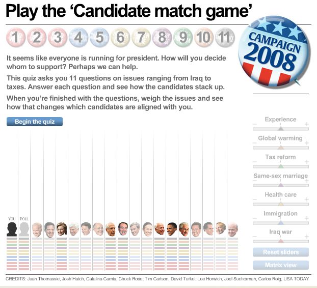
As you answer questions, the bars under the candidates are updated with their answers, so that the survey shows only the information you’ve “unlocked” so far with your own answers. The more a candidate agrees with you, the higher the stack of bars under them. Stack of bars that are very compressed show almost no correspondence with your own views. Luckily, the survey also includes all of the former candidates, so you can see who you would have voted for had that candidate been able to continue.
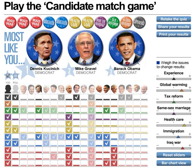
Once you’ve finished the survey, you have a wonderful overview—at a glance—of the quite large amount of information available. You can now adjust the sliders on the right to add weight to those issues that you feel are important; those weights are taken into account on the fly by the graphic. You can also switch to the matrix view to see which of your views are shared by the other candidates (with a strict yes/no).
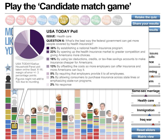
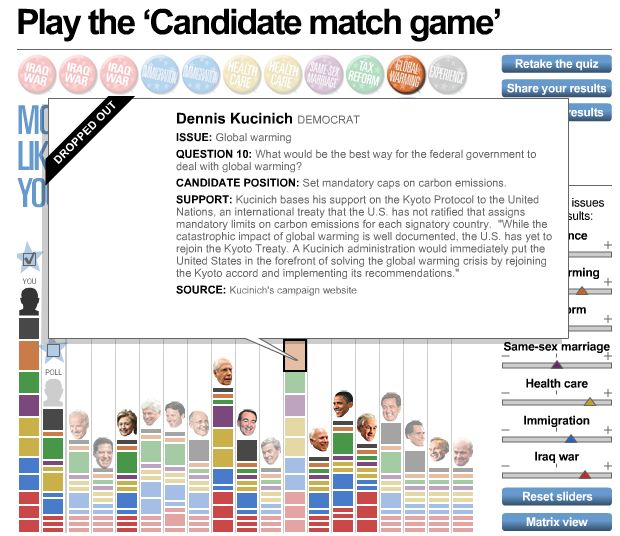
The information density is even higher than you would expect at first glance. You can also hover over any issue on any candidate and see their position along with an explanation of that position obtained either from the candidate’s speeches or their campaign materials (l. below). Hovering over any one of the bars under the “poll” shows the exact breakdown (to date) of responses from other survey participants (r. below).
A hearty “well done” to whoever designed this survey: it’s nice to see such a usable design for something this important.
Thanks to D for the tip!