
Fielmann’s web site still sucks
Published by marco on
We have been here before, in 2021 and twice in 2025.
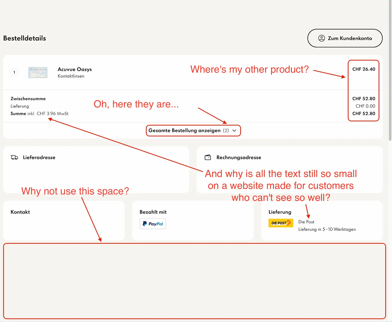 Fielmann's design continues to be terrible
The Fielmann web site continues to be an unadulterated train wreck.
I’ve deleted the private information from the screenshot, so there’s a bit more “whitespace” than in the original.
- The fonts are unnecessarily tiny. This web site is made for customers who have trouble seeing. WTAF.
- Look at how much whitespace there is! There is so much wasted space that could be filled with information, like the products that I’d ordered! Instead, the products I’d ordered are hidden behind a dropdown that you have to manually toggle. There is a ton of sexy whitespace available at the bottom, though.
This is just so maddening. How is the world incapable of making a web shop after decades and decades of building web-shop front-ends? There should just be a standard way of doing it, like the way you can drive pretty much any car because the controls are all in the same place.