The phrase “to beg the question” has become much more popular outside of philosophical circles. In almost all cases, it is being used incorrectly. When you hear someone say the phrase, then follow it with a question, they are doing it wrong. Consider the following cartoon about Obama’s involvement in the Blagojevich scandal:
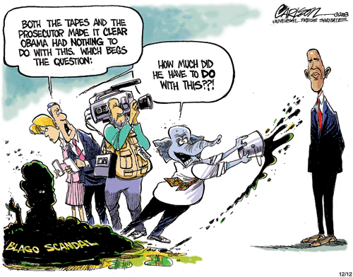 Stuart Carlson − Obama, Republicans and Blagojevich
In this case, the reporter actually means, “which raises the question”. It is common practice for people to dress up their language to make what they’re saying sound more... [More]
