Initial update to the style and structure of earthli.com
Web browsing has come a long way since earthli’s default style was originally created. It was high time to clean out the decade-old default style and apply some modern design ideas to it. Nothing radical, but any design of a certain age will end up being more appropriate for older browsers than more modern ones.
On the one hand, the style accumulates cruft engendered by browser limitations that no longer apply and, on the other, the basic layout no longer works well on the most common device-display sizes.
Guidelines
As with any UX overhaul, I followed a set of guidelines to help me make decisions.
- Left alignment: Use left alignment as much as possible. Avoid center-aligned elements as much as possible.
- Reduce padding: Avoid horizontal padding as much as possible
- Use margins: Use vertical margins instead of padding to profit from margin-folding
- Consistent spacing: Pick a spacing unit and apply it consistently throughout rather than using em-based or randomly chosen spacing
- Reduce icons: Do not disturb left-alignment with needless icons in front of headings[1]
- CSS images: Use CSS backgrounds instead of image icons wherever possible
- Menus as lists: Use semantic structures for lists of buttons and links
- Big buttons: Buttons should be large enough to be usable from a mobile device
- Consolidate controls: Buttons should be collected into a common area rather than sprinkled about the page
- Less boxy: Avoid boxes; instead, use negative space to distance elements from one another
- Use headings: Use HTML headings instead of CSS classes to improve semantic value
- Use the whole page: Use the full page width for content wherever possible
- Fewer columns: Avoid using columns wherever possible; instead, collect tools/related content into a header (improves usability and space usage for mobile devices)
- Larger/better font: Switch to a larger, more readable font by default
- Reduce clutter: Move elements out of high-traffic areas wherever possible (e.g. move distracting elements from header to footer)
- Don’t repeat yourself: Avoid including the title of a page in multiple places wherever possible
I also had the help of a design consultant (thanks Kath!) who helped me cut several Gordian knots with aplomb. She’s not to be blamed for any remaining shortcomings, but can be lauded for letting me know when I wasn’t quite finished with a particular element yet. Oh, and she knew all along that we would end up using this font (Raleway).
General changes
- earthli now uses the Raleway font everywhere; you can choose from several other, much more modern-looking fonts from the theme page.
- The default font size is also set to medium instead of small (you can still change it back in the theme settings, now found in the footer rather than the header).
- Default line-spacing is now 160% to loosen up the text; this line-spacing is applied nearly everywhere rather than just text blocks.
- The whole page is now left-aligned rather than centered in the browser viewport
- Theme selection and “Show source” have been moved to the footer from the header
- Footer elements are all left-aligned
Home page
Since the site content hasn’t changed at all, the home page hasn’t changed too drastically.
- The left column has been removed
- Polls have been removed
- The earthli WebCore box has been moved to the bottom of the page
- Album thumbnails are larger, left-aligned and there are now more of them
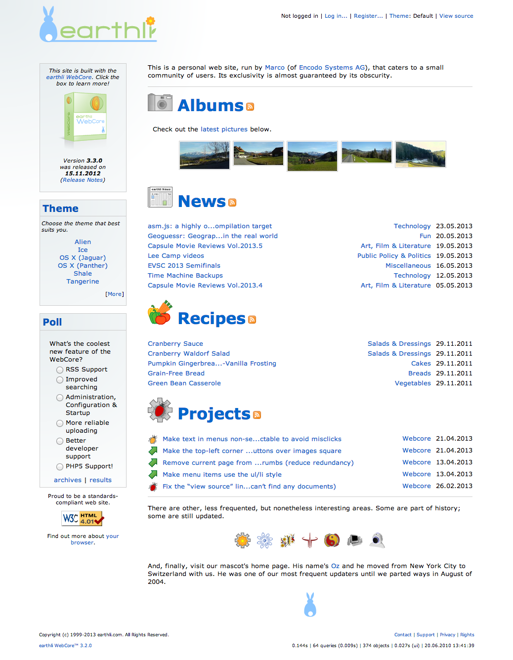 Original Home Page
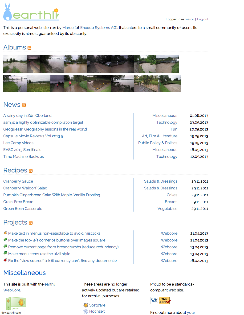 New Home Page
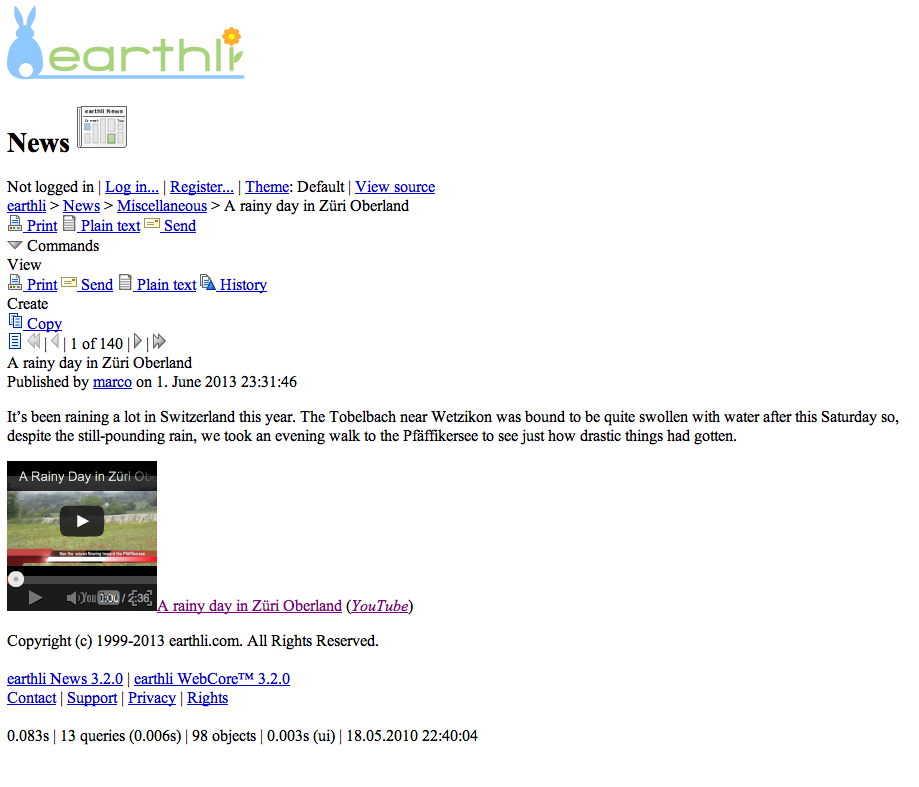
News index
Application index pages no longer use a left column to display associated information. Instead, associated information is confined to a header block that stretches across the whole page, leaving room for the content to use the width of the page. The header area has a maximum height so that the beginning of the content should remain visible in almost any window.
Some more specific changes are,
- All commands are now consolidated into the “Commands” button/menu.
- Subscriptions are now managed from the “Commands” button as well (rather than as a separate form or link).
- The search form is closer to the top of the page, where users expect. Its location is constant rather than dependent on other content on the page (e.g. the index-page description or the list of sub-folders).
- The pager control uses much larger buttons and is more obviously a set of controls; it no longer uses icons and has been redesigned to stay as stable on the page as possible when moving from one element to the next
- Many horizontal lines have been removed; controls have been consolidated
- The breadcrumbs now includes the name of the page as well; the name of the page is not repeated anywhere else
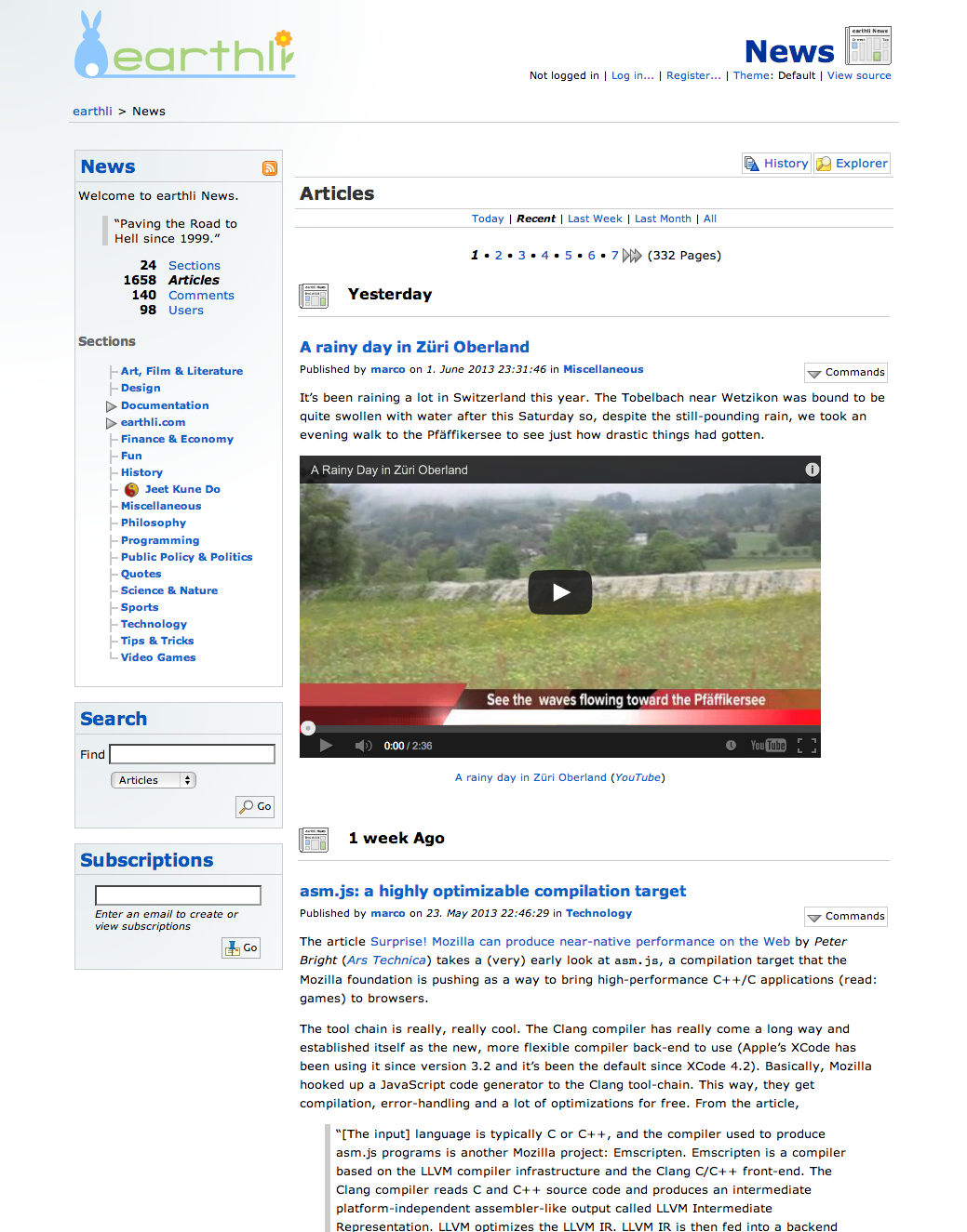 Original News Index
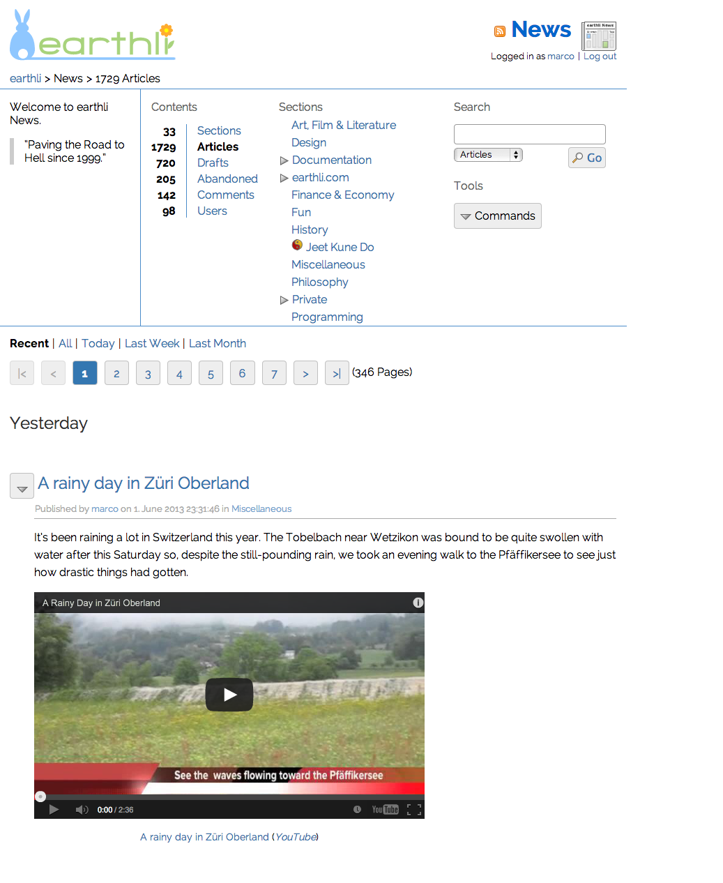 New News Index
Albums index
The improvements listed for the news index above are equally valid for the albums index. In addition,
- Because of the additional space for content (boxes or columns are gone), the albums can now show three columns of thumbnails instead of two
- The “Commands” button is left-aligned and overlaid on the thumbnail rather than taking up additional space
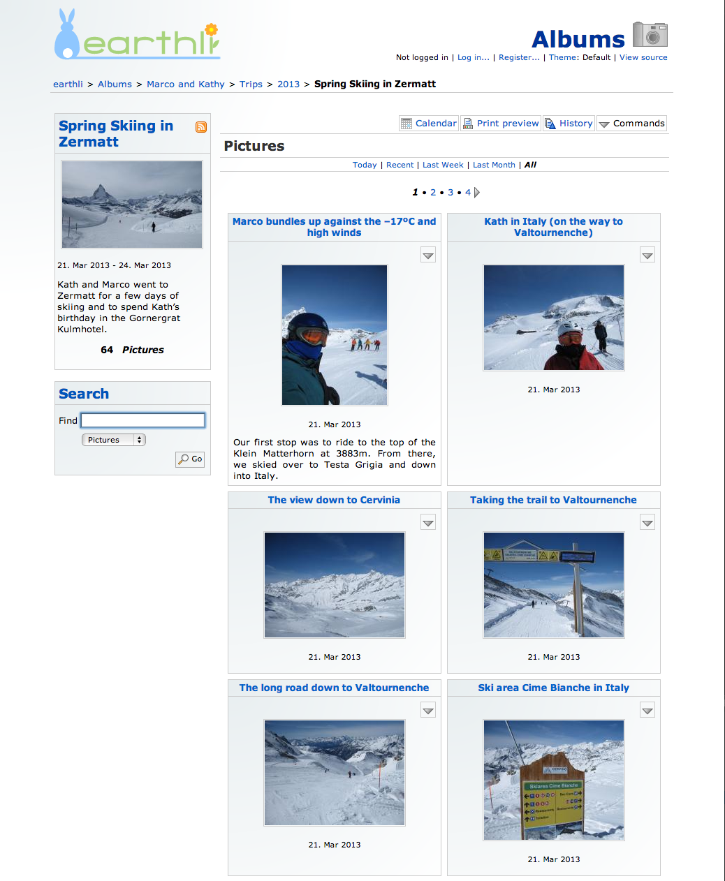 Original Albums Index
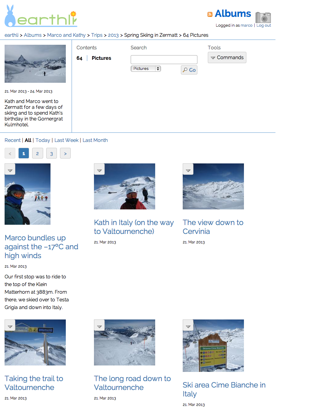 New Albums Index
Article page
The article page is representative of all detail views (e.g. for pictures, articles, journals, jobs, recipes, etc.).
- The title of the element is repeated here, but with good reason: the breadcrumbs should be consistent, but the header makes it obvious that the page focus is on a single element
- All buttons are consolidated into a single, left-aligned area at the top of the page (the “toolbar”)
 Original article page
 New article page
Picture page
The picture-page update is similar to that for the article. In addition, the whole picture is no longer center-aligned, nor is the date right-aligned.
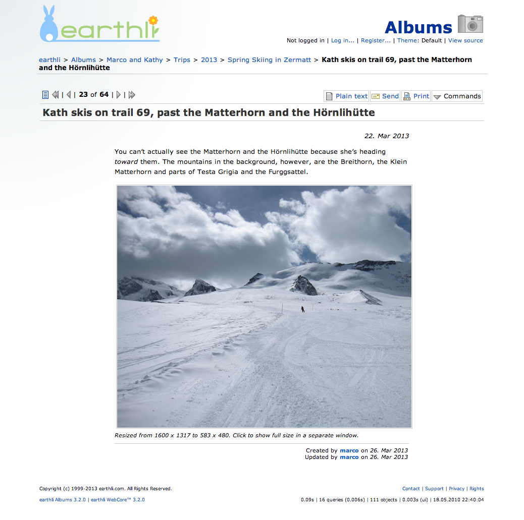 Original picture page
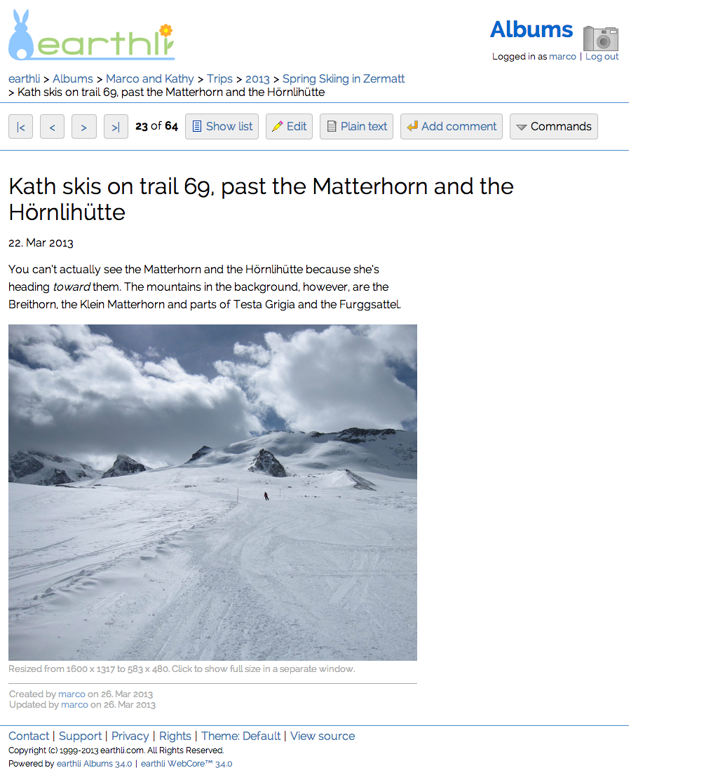 New picture page
You can still see the other pictures in this album in a list but, instead of showing the items in a list on the left, the context is shown in an area at the top instead. The next/previous buttons are larger and much more tablet/mobile-friendly, as well.[2]
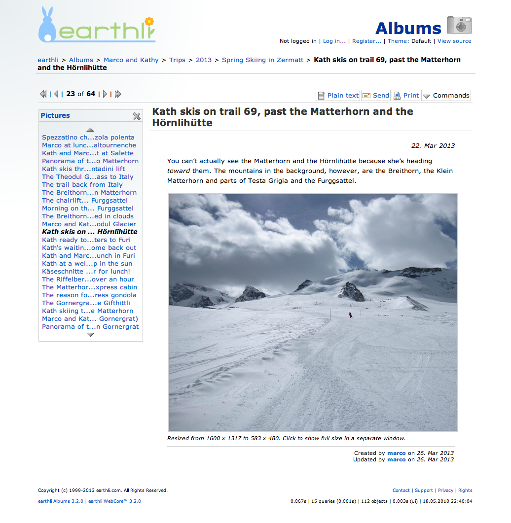 Original picture page (with context list)
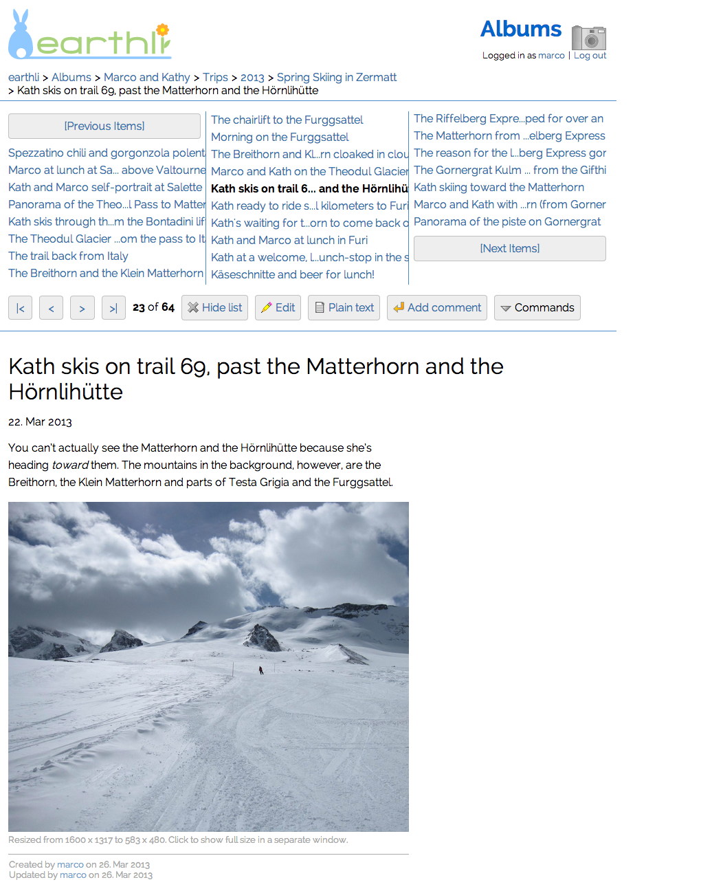 New picture page (with context list)
Article page structure
And, finally, for those who care about valid, clean, semantically useful HTML, the following screenshots shows some improvements in that regard.
- Non-content image icons are gone
- Banner and logo images have been moved to CSS
- Lists of menu items and buttons are represented by HTML lists
- Titles use HTML headings rather than semantically empty DIV tags
 Original article page with no css
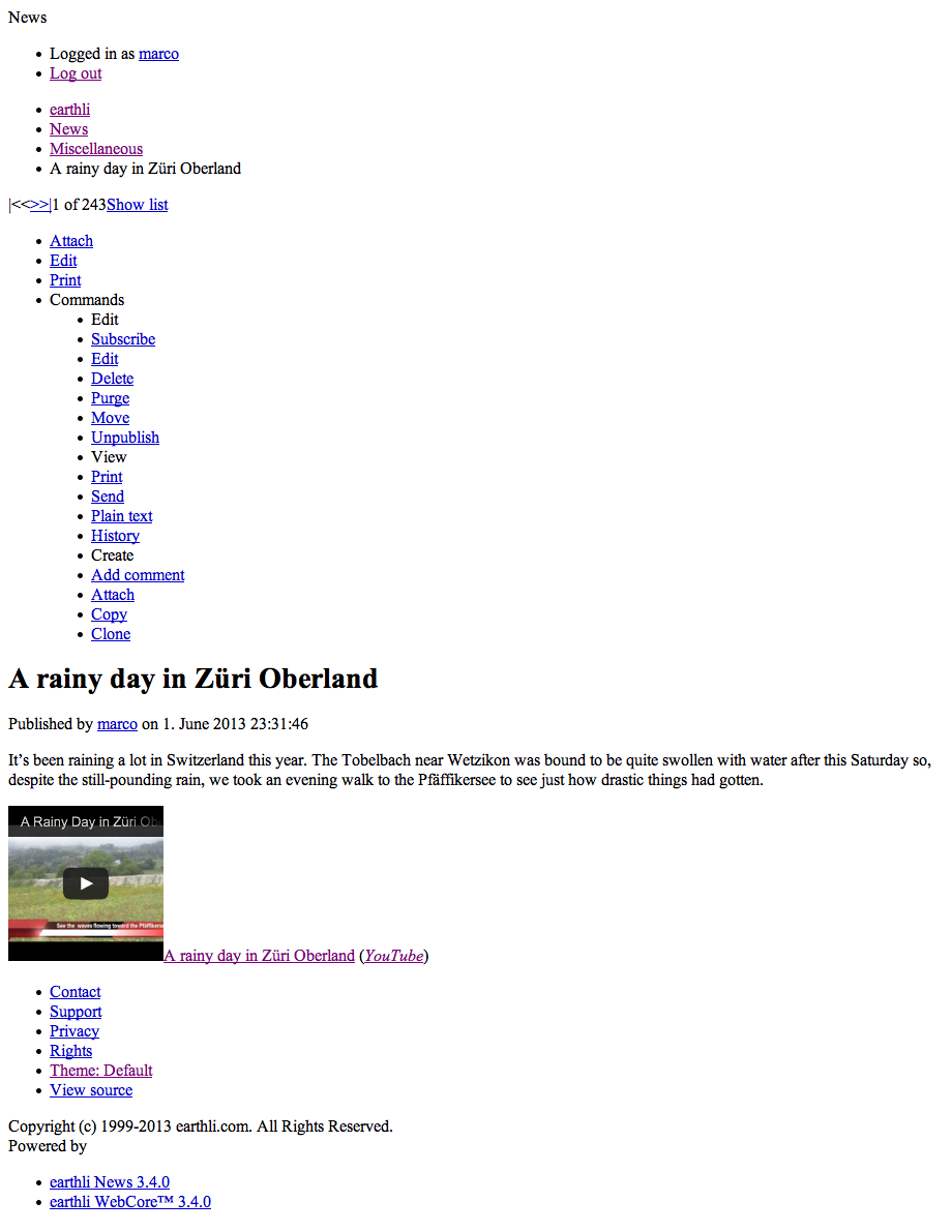 New article page with no css
What is there still to do?
The style you see on earthli right now is only the first cut. I’m quite happy with it and don’t feel a lot of pressure to fix anything immediately, but the redesign was consciously limited to adjusting style without changing functionality or how that functionality is presented to the user. A more dynamic design that uses more JavaScript and Ajax was not considered for this phase. It was enough work just getting this phase completed.
- Continue minor clean-up, fixing issues as they arise
- Address UX issues in the context links for individual items (see footnote [2] below)
- Convert the other themes to follow the new guidelines (and possibly deep-six a few of them that are too dated)
- The CSS for the site is still maintained by hand, but would benefit from a pre-compiler like CSS.less.
- Take a look at replacing the colored icons with a more common, standard set, like the font-based ones from Font-Awesome.
- While tables are not used for layout, styles for some columns and grids still use “table” and “table-cell” display styles in some places where a more responsive & fluid approach would be more appropriate.
All in good time, of course. Until then, I hope you enjoy the new style!
[1]
Exceptions were made in a couple of places:
- The list items corresponding to jobs on the home page show the job-type icon at the front of the line. This was done for pragmatic reasons: the icon conveys important information and there is just no more appropriate location for it.
- The “Command” button is placed before the title of each article in News index. This was again done for pragmatic reasons, as the natural location is to the left of the title rather than the right (where the menu would often appear cut off by the right side of the viewport). In fact, the command button is very consistently placed to the left of the title throughout the earthli applications. Every design involves trade-offs.
[2] This part of the UI is still a bit of a work-in-progress. The text is cut off for longer links and it’s not obvious whether it’s better to have the toolbar above the context links or below them.↩