19 years Ago

Control

Published by marco on in Quotes

“Those who can make you believe absurdities can make you commit atrocities.”
Voltaire

Published by marco on in WebCore

 Though still not officially available, earthli.com has migrated to the latest and greatest version of the earthli WebCore. Look for a downloadable release within the next week or so. In the meantime, you can cruise around earthli and see some of the improvements for yourself. As with most WebCore releases, the differences are mainly non-cosmetic and of benefit to developers working with the library. However, there are noticeable improvements to the toolbars, menus and other UI elements.

Microsoft “Live”

Published by marco on in Design

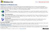
 We’ve seen how firms large and small bring their sites up to speed. The screen shot to the left is Microsoft’s enchanting new Windows Live site. Granted, it looks like they’re still working on it, but let’s take a critical look at it anyway. (Not ready for prime time? Leave it offline.)

Their icons are fine, but don’t they have designers at that big old company? The content wraps around the icons in a way that was cool in 1995 when Netscape finally managed to do it without crashing all the... [More]

“Top of the Line” Workstation Redefined

Published by marco on in Technology

 PowerPC G5 (Side View)The new quad processor solution from Apple for their G5 line is an amazing machine. It would certainly be good enough for any other company to trumpet as their flagship product. Not Apple. If you enter their online shop and start to configure a system, you’ll notice that there is a curious option under “Graphic Cards”.

“Quadro FX 4500 / 512MB SDRAM [+ CHF2400.00]*”

*I was shopping in the store in Switzerland … that’s about $1875.

Cheeky.

Google will tell you that this is not a typo — the... [More]
Technology Reporting

Published by marco on in Technology

Tech reporting is spiraling ever downward: information generally starts out in the form of a carefully vetted press release and is copied verbatim to one of the big “news” sites (CNet, I’m looking at you), where it’s adorned with banner ads and clever user comments. From there, other sites copy chunks of these “articles” and paste them on their own pages with their own ads and their own clever users. As an example, there is this short article called Microsoft Takes Aim At Google (Slashdot). It is quoted... [More]

Scott McClellan dead at age 37

Published by marco on in Public Policy & Politics

According to Cheney Looms Large in Latest Twist of CIA Leak Drama (Common Dreams):

“McClellan was also asked by reporters whether Cheney always told Americans the truth. … ‘Yes,’ he said. ‘The vice president, like the president, is a straightforward, plainspoken person.’”

Scott McClellan died at 16:34 later that day from third degree burn wounds suffered from multiple lightning strikes.

Edgewall Software Services

Published by marco on in Design

  Another in an growing list of sites that make XHTML+CSS look really good. This is a consulting company for web and software services, which makes good use of shades of a single color (red) to differentiate between their 3 service areas. The generic graphic adds an elegant touch to the home page and the rest of the page doesn’t distract. There is a subtle news list on the right, with releases of their job tracking product, Trac, which also looks quite nice and functional. The product page for... [More]

Freedom

Published by marco on in Quotes

“Freedom is never voluntarily given by the oppressor; it must be demanded by the oppressed.”
Martin Luther King

RoundCube

Published by marco on in Design

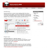
 Now here’s an open-source project that knows how to look good. The banner at the top sets a bold color theme that the rest of the page uses and has a simple set of menus below with the important points for a software project. Subtle use of gradients gives it a professional look and the big screenshot (of an equally nice-looking UI) lets the graphics do the talking. All XHTML/CSS compliant (as is their product); the “made on a Mac” logo at the bottom shouldn’t come as a big surprise. The concise... [More]

Absolute Truth

Published by marco on in Quotes

“It is the purest arrogance to suppose that an instrument so fallible as the human mind can even conceive absolute truth, much less comprehend it.”
Response to an overzealous (aren’t they all?) Jehovah’s Witness

Knowledge

Published by marco on in Quotes

“It is the mark of an educated mind to rest satisfied with the degree of precision which the nature of the subject admits and not to seek exactness where only an approximation is possible.”
Aristotle

Joyent

Published by marco on in Design

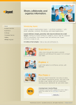
  Joyent is a web applications company with a suite of applications for small businesses. Their home page is a nice mix of browns and oranges; the menu side-bar has an especially clean feel to it. The purchase page looks good too, with a large “SALE” sticker in the upper left that seizes your attention. Excellent use of advanced styling for the links and callout boxes. (Joyent Home Page)

Opera “Feel Free” Promotion

Published by marco on in Design

 This just jumps out as a very nice, clean (and distinctly Apple-like) promotion for a big step in an existing product. It’s a great, colorful way of drawing attention to a product. (Opera “Feel Free” Promotion)

AimOneSoft

Published by marco on in Design

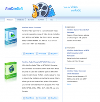
 This site has a very consistent and clean look, making good use of subtle gradients to give it a “painted” look without overdoing the colors. It looks happy and sophisticated — not at all dour and corporate, but exhuding confidence in the products. (AimOneSoft Home Page)

Camino Web Browser

Published by marco on in Design

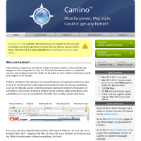
 Camino is a Mac OS X-only product that also makes excellent use of color to draw attention to its download buttons and warning box at the top. Note the use of an abstract header graphic at the top to contain the logo. (Camino Browser Home Page)

Obvious Diversion

Published by marco on in Design

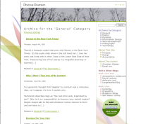
 There’s not much to say here, except that sometime many colors can look nice. The menus on the right are in several shades of soft pastel and are quite harmonious. Keep it in mind as a choice for themes. Nice that it matches the big background graphic. (Obvious Diversion Home Page)

Apple Nano

Published by marco on in Design

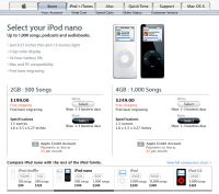
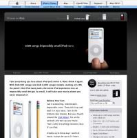
  And then there’s Apple. They have an enviable style to their pages. The large black block draws in the eye to the product. The product description uses a nice open line-spacing and magazine-style picture layout to make a pleasing picture. “Buy now” is nice and obvious against the white background (and doesn’t even introduce an extra color, matching instead the banner). The store page highlights the two colors available (matching the selection buttons to the products) and using small pictures... [More]

Bartleme

Published by marco on in Design

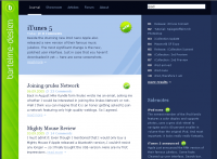
 Similar to the blue man web site, but less 3d, it makes good use for color for the different areas. The search at the top is “Live” and results update as you type above the Sidenotes. The green new icon also draws the eye. Click an article and scroll down to see the comments view, which is also a nice touch. (Bartleme Home Page)

Zaadz

Published by marco on in Design

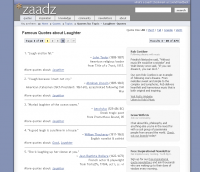
 This is another pretty clean-looking design. In particular, the page navigation is nicely organized and presented. The breadcrumbs are integrated under the section tabs and the “Quote Size” buttons on the right are like a toolbar (with result count shown in the same area). All information is gathered at the top. The company web site and philosophy are also interesting (Zaadz Home Page)

Steel Gryhon Blog

Published by marco on in Design

 Another relatively clean look; the thing of note is that the tab folders here are nicely done, collecting the date and topic without being too disturbing. (Steel Gryphon Home Page)

WebSideStory

Published by marco on in Design

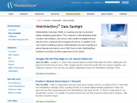
  A very corporate web site, but light-colored as well. Good use of line spacing (1.30em), light menu headers on top (tightly against one another and turning light gold when hovered). Uses green for the “read more” links to draw the eye and differentiate from menu links. The bottom of the page has an elegant copyright and site info section, with nicely grayed images. (WebSideStory Home Page)

The Man in Blue

Published by marco on in Design

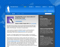
  Tight, good-looking use of strong blue color. The frame around the lead-in graphic looks very good too. Note the use of an initial gradient on the article text to give it more texture. Header, navigation, content and sidebar are clearly-defined areas with their own colors. (TheManInBlue Home Page)

Steam (Valve Software)

Published by marco on in Design

 Nice use of dark military colors; the first page (seen to the right) also makes good use of a familiar “shopping flier feel” for sales information. At the bottom is a list of credit cards supported, which offers information and an nice visual touch. (Steam Home and Steam News)

IntelliJIdea

Published by marco on in Design

 A single-product web site with two columns and modest use of color for attracting attention. Note the “What’s new” and “Download” buttons featured prominently and that the product description, upgrade and documentation information all fits into the first scroll pane. (IntelliJIdea Home Page)

Enlightenment

Published by marco on in Design

 Nice use of watermark graphics in text boxes (see logo at bottom right). Site is a bit slow; have patience. (Enlightenment Home Page)

Inside Mac Games

Published by marco on in Design

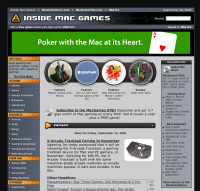
 This is a gaming site and looks it, but the menu design on the left is quite tight and looks “solid”. The “bubbles” in the middle serve to nicely accent the important parts of the site. Compare and contrast with the highly metallic style of GameSpot. They have a very similar layout, but more boxy (though the headers for the boxes are nice). (Inside Mac Games Home Page)

Haiku

Published by marco on in Design

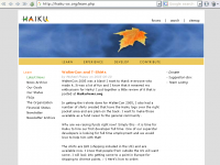
 This BeOS-variant maintainer is simple, but quite nice. I find the banner graphic fits with the logo quite well. Both the actual logo and the site icon (3 leaves in a circle) are elegant and nice. (Haiku Home Page)

Dynarch Navbar (JavaScript UI Controls)

Published by marco on in Design

Mike Lischke’s Soft Gems site is a good example of this cool control in use. It uses accelerating/decelerating animation and opacity progression to show/hide menus. Very slick … and it’s cross-browser. (Dynarch Navbar Home Page)

UserPlane

Published by marco on in Design

 Nice, clean, professional single-product web site. Icons are simple, consistent and single color; uses one other color for the word “Free”. (UserPlane Home Page)

There’s Pie in the Lunchroom

Published by marco on in Design

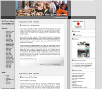
 This site is quite nice, using the four colored boxes motif to make their sidebars and articles distinct. Especially nice is the gradient shading at the bottom-left hand corner to separate the text blocks from each other and to draw attention to the details for each block.

I kind of like the little stipple-pattern used as a separator too. (Pie Home Page)